TL;DR: Discover how minimalist wedding invitations combine elegant typography, breathing room, and clever phrasing to create a stress-free, beautiful experience for you and your guests.
Planning your big day often feels like a massive whirlwind of decisions, colors, fonts, and endless details. When it comes to setting the right tone, beautiful minimalist wedding invitations serve as a breath of fresh air. They instantly communicate a sense of modern elegance, letting your guests know exactly what to expect without overwhelming them with visual clutter.
Many couples worry that stripping away heavy graphics or intricate borders might make their digital invites feel a bit too plain. We are here to show you that the exact opposite is true. By embracing simplicity, your love story actually takes center stage. A clean design naturally guides the eyes of your readers, ensuring even your elderly guests can find all the crucial details without reaching for a magnifying glass.
Let us explore everything you need to craft the perfect digital experience. From discovering the best modern wedding invite templates to utilizing an exclusive template wording pack, you will learn exactly how to master the less-is-more aesthetic.
What Defines the Minimalist Wedding Invitations Style
True minimalism goes far beyond just leaving a blank white background on a screen. It is an intentional, highly curated design philosophy that focuses entirely on function and raw beauty. When you choose minimalist wedding invitations, you are making a conscious choice to eliminate distractions. You want your guests to feel calm, welcomed, and informed the second they open your link.
The visual tone of this style relies heavily on balance. Think about the feeling you get when you step into a high-end art gallery. The art stands out because there is ample space around it. The same principle applies to your modern wedding invite templates. By giving your text room to breathe, the essential information transforms into a visual art piece itself.
Emotionally, this aesthetic feels incredibly reassuring. It signals to your guests that your celebration will be sophisticated, organized, and focused on genuine connection rather than over-the-top pageantry. It creates a seamless bridge between your tech-savvy preferences and the timeless romance of your upcoming celebration.
The Core Elements of Less is More
To pull off this sophisticated look, you need to understand the fundamental building blocks of the style. You cannot just delete a few floral graphics and call it a day. It requires a strategic approach to design.
Here is a handy checklist of the core elements that make a minimalist wedding invite truly successful:
- Generous Negative Space: Allowing large areas of the screen to remain empty, which naturally directs focus to the most critical details like your names and the date.
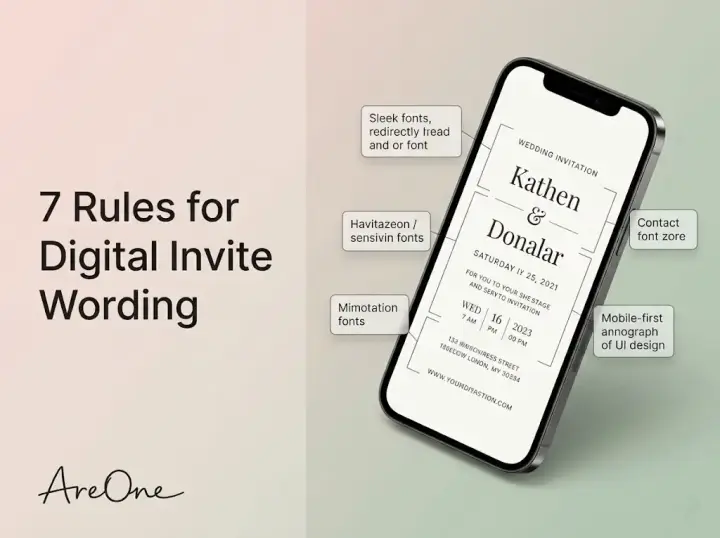
- High-Contrast Typography: Pairing a classic serif font with a clean sans-serif font to establish a clear visual hierarchy without relying on bold colors.
- A Restrained Color Palette: Sticking to two or three muted tones, such as charcoal, soft cream, blush, or sage green.
- Purposeful Imagery: Using a single, high-quality engagement photo rather than a collage of multiple images.
- Streamlined Navigation: Ensuring the user interface is completely intuitive, allowing older guests to RSVP with a single click.
Mastering these elements is your golden ticket to a stunning digital presence. For more inspiration on balancing these features, check out our comprehensive digital wedding invitation templates style guide.
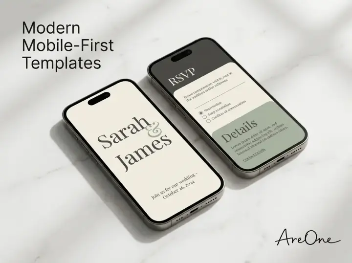
Best Modern Wedding Invite Templates to Try Right Now
Choosing the right foundation is the most critical step in your design journey. The best modern wedding invite templates do the heavy lifting for you, providing a pre-balanced layout where you only need to plug in your unique details. We highly recommend exploring options that prioritize mobile responsiveness, as the vast majority of your guests will view your invitation on their smartphones.
When browsing our curated digital templates, look for designs that offer dynamic typography. Some templates feature an oversized, dramatic font for your names, while the supporting details remain understated and small. This contrast is incredibly eye-catching and modern.
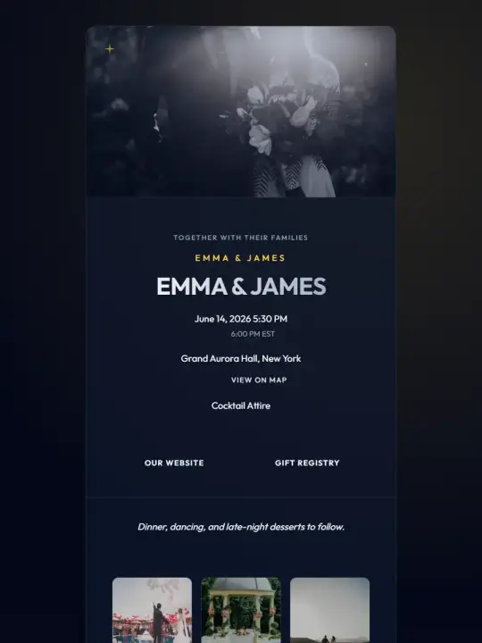
Another fantastic option is the monochromatic template. This style uses varying shades of a single color to create depth without introducing chaotic rainbows. It feels remarkably cohesive and allows your carefully chosen wording to shine brightly.
Evaluating the Top Picks for Your Vibe
To help you narrow down your choices, we have broken down three of the most popular minimalist styles. Depending on the exact mood of your venue and personal taste, one of these will likely speak directly to your heart.
| Template Style | Defining Visual Feature | Best Suited For | Suggested Font Pairing |
|---|---|---|---|
| The Editorial | Magazine-style layouts with dramatic, oversized text. | Chic city weddings, loft spaces, and evening affairs. | Didot (Headers) + Helvetica (Body) |
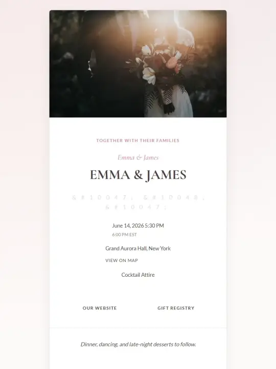
| The Organic Minimalist | Soft, earthy color palettes with gentle, flowing lines. | Outdoor celebrations, vineyards, and intimate elopements. | Cormorant Garamond + Open Sans |
| The Absolute Purist | Stark black text on a brilliant white or cream background. | Black-tie events, museums, and classic romantic settings. | Playfair Display + Lato |
Selecting from these options ensures your guests instantly grasp the formality and vibe of your event before they even read a single word.
Recommended Reading7 Best Tips: What to Write in Digital Wedding Invitations →The Ultimate Template Wording Pack (Copy-Paste Examples)
Launch a beautiful invitation in minutes.
Stop chasing RSVPs. Choose a designer-crafted template equipped with smart guest tracking and automated reminders.
Explore Templates →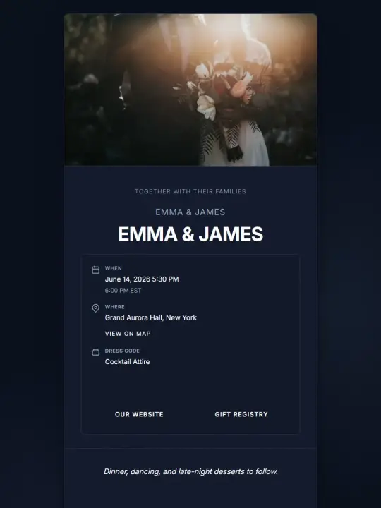
Now that you have your gorgeous layout, what exactly do you say? A beautifully sparse design demands equally refined copy. We have put together an exclusive template wording pack designed specifically to complement your minimalist wedding invitations.
Copy-Paste Example 1: The Modern Formal
Use this when hosting a black-tie or highly structured event, but you still want to keep the phrasing brief and elegant.
"Together with their families,
Sarah Jenkins and David Miller
invite you to celebrate their marriage.
Saturday, the fourteenth of October
Two thousand twenty-six
At four o'clock in the afternoon.
The Glasshouse, New York City.
Dinner and dancing to follow."
Copy-Paste Example 2: The Casual & Intimate
Perfect for a relaxed backyard gathering or a small restaurant reception where love is the only true focus.
"We're getting married!
Sarah & David
10.14.2026 | 4:00 PM
Join us for vows, drinks, and a wonderful evening.
The Glasshouse, NYC."
Copy-Paste Example 3: The Direct Elopement Celebration
Ideal for couples who tied the knot privately and just want to party with their favorite people.
"We eloped!
Now it is time to celebrate.
Sarah & David
Join us for an evening of food and dancing.
10.14.2026 | 6:00 PM
The Glasshouse, NYC."

Why Brief Wording Works Wonders
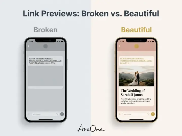
You might be wondering if cutting down the text makes the invitation feel less warm or less polite. Absolutely not. Brief wording works wonders because it drastically reduces the cognitive load on your guests. Instead of hunting through paragraphs of poetry to find the start time, they see the critical facts instantly.
This approach is especially helpful when dealing with international guests. If you are leveraging our multilingual invite feature, shorter sentences translate much more cleanly and maintain the integrity of your template's layout across different languages. Less text equals a smoother, more elegant user experience for absolutely everyone involved.
Personalization Tips: Photos, Colors, and Typography
Minimalism does not mean your design has to look identical to everyone else's. Personalization is what transforms a sterile template into a warm, inviting reflection of your relationship. The trick is to customize with immense restraint.
When incorporating photos, skip the busy backgrounds. Select an engagement photo where you and your partner are the absolute focal point, preferably with a muted or out-of-focus background. A black-and-white photo is a phenomenal choice for a minimalist wedding invite because it removes color clashes and adds an instant touch of timeless drama.
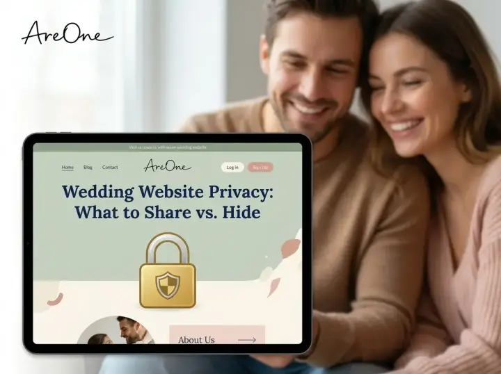
Regarding colors, stick to the two-color rule. Choose one primary background color and one highly contrasting text color. If you desperately want a pop of color, use it sparingly for a specific element, like the RSVP button. Understanding how to utilize these features within your budget is easy when you review our transparent pricing plans, ensuring you get premium design tools without any surprises.
Need a faster RSVP flow?
Use AreOne to collect guest replies, meal choices, and reminders in one clean workflow.
Keeping It Readable on Every Device
Never sacrifice readability for the sake of an aesthetic. Your grandparents need to be able to read the venue address just as easily as your tech-savvy college friends. Keep your font sizes reasonably large, especially for the body text.
Color contrast is non-negotiable. Light gray text on a white background might look incredibly chic to a designer, but it is a nightmare for accessibility. We strongly encourage you to follow standard web accessibility guidelines to ensure your contrast ratios are high enough. A dark charcoal or rich espresso brown provides excellent readability while feeling slightly softer than harsh, pure black.

Common Mistakes Couples Make With a Minimalist Wedding Invite
Even with the best intentions, couples frequently stumble when trying to execute a clean aesthetic. Knowing these pitfalls ahead of time will save you hours of frustrating redesigns and ensure your digital platform remains pristine.
Mistake 1: Overcrowding the Main Page
The most frequent error is treating the primary invitation screen like an entire wedding website. Couples try to cram the schedule, the dress code, the registry links, and the travel accommodations onto a single digital page. This completely destroys the minimalist vibe. Instead, keep the main page strictly for the who, what, when, and where. Move all the supplementary details to secondary tabs or specific informational sections.
Mistake 2: Mixing Too Many Fonts
Typography is the heartbeat of minimalist design. A major mistake is using three, four, or even five different fonts to try and make things look interesting. This creates visual chaos. Stick to a maximum of two fonts: one decorative or serif font for headers, and one highly legible sans-serif font for all the supporting details. Consistency is your best friend here.
Mistake 3: Forgetting the Logistics of the RSVP
Sometimes couples get so swept up in creating a beautiful digital art piece that they bury the RSVP button or make the response process confusing. Your elegant design is ultimately a functional tool. You must make the call-to-action painfully obvious. Learn more about optimizing your guest response flow by exploring our seamless RSVP features, which keep your clean design intact while gathering essential data effortlessly.
Mistake 4: Ignoring the Power of White Space
Many people feel nervous when they see empty space on a screen. They feel an overwhelming urge to fill every corner with a floral graphic, a line divider, or an extra photo. Resist this urge completely. White space is not empty space; it is the active breathing room that allows your important text to stand out. Let the design breathe.

A Beautifully Simple Statement
When it comes to planning your celebration, making a massive, unforgettable impact often requires stripping away the unnecessary noise. Opting for minimalist wedding invitations ensures that your romance, your names, and your joyous news take their rightful place at the absolute center of attention.
Ready to design your dream invite?
Experience the beauty of less-is-more with our premium tools.
Start free / Create your digital invite at AreOne.org Browse our modern templatesFrequently Asked Questions
Find quick answers to common questions about this article.
No approved comments yet.