
TL;DR: Creating a wedding website for older guests requires clear layouts, readable typography, and simple language to ensure everyone can RSVP with confidence.
Planning a wedding is a beautiful journey, filled with endless decisions about flowers, menus, and seating charts. You spend months pouring your heart into crafting the perfect celebration for your closest family and friends. Yet, many couples unintentionally overlook a critical aspect of the modern wedding experience: the digital invitation. As you set up your online portal, ensuring you create an inclusive wedding website for older guests is just as important as picking the right venue. Grandparents, elderly aunts, and senior family friends are often the most excited to celebrate your special day. They eagerly anticipate reading your love story, viewing your engagement photos, and officially submitting their digital response.
However, navigating online platforms can sometimes feel overwhelming for individuals who did not grow up with smartphones in their hands. If your text is too small or your menus are confusing, you risk frustrating the very people who cherish you the most. Building an inviting online experience does not require an advanced degree in web development. By making a few mindful adjustments to your font choices, spacing, and wording, you can ensure that every guest feels respected and valued. An accessible design means your loved ones can independently find the ceremony directions, book their hotel rooms, and RSVP without needing technical assistance from younger relatives.
Accessibility Basics for Wedding Guests
Understanding the foundation of an inclusive digital experience begins with recognizing the diverse needs of your attendees. When we talk about making a platform accessible, we are referring to the practice of designing digital content so that it can be used easily by people of all abilities and ages. For your wedding hub, this simply means removing any digital barriers that might prevent a guest from finding crucial information. As our vision naturally changes over time, many older individuals struggle to read small text or decipher light gray fonts on a white background. Motor skills can also change, making it difficult to tap tiny buttons on a mobile device.
Creating an inviting space online is an extension of your hospitality. Just as you would ensure your physical venue has clear signage and accessible seating, your digital venue must be equally accommodating. When an older guest clicks the link you texted or emailed them, their first impression should be one of clarity and comfort. They should immediately understand where to find the ceremony time, the dress code, and the crucial RSVP button. Providing this level of clarity requires a thoughtful approach to visual hierarchy, meaning the most important information is presented first and prominently.
Following Established Digital Standards
To accommodate everyone on your guest list, it is helpful to look toward established digital standards. The World Wide Web Consortium provides comprehensive frameworks for creating usable digital environments. By adhering to the Web Content Accessibility Guidelines, you ensure your platform is universally welcoming. You certainly do not need to be a software developer to implement these basics. It simply requires a mindful approach to design choices, such as generous spacing, stark colors, and legible font selection. We will break down exactly how you can apply these principles to your own celebration hub to eliminate any potential stress for your beloved guests.
If you want to dive deeper into all aspects of digital inclusivity for your big day, you can explore our complete guide to wedding website accessibility. Taking these extra steps ensures your digital first impression matches the warmth and joy of your actual wedding day.
Typography & High Contrast Design Checklist
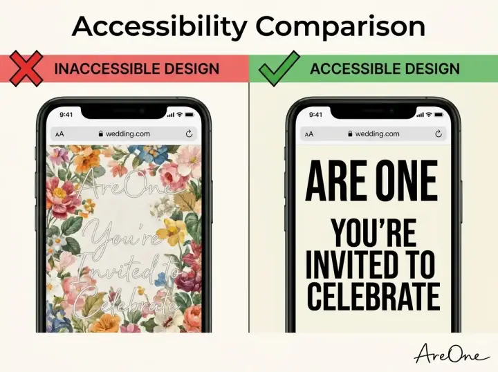
Selecting the right typography is crucial for readability. While elegant, sweeping calligraphy fonts might look stunning on a physical paper invitation, they are notoriously difficult to read on a glowing digital screen. For the main body text of your website, prioritize clean, sans-serif fonts like Arial, Helvetica, or Roboto. These fonts lack the tiny decorative flourishes at the ends of letters, making them much crisper on mobile devices and computer monitors. You can certainly use decorative fonts for large headers or your names, but keep the essential details simple and legible.
Determining the right font size for older users is another major factor in ensuring your website is user-friendly. A common mistake is setting the body text to 12 pixels, which often forces older readers to squint or zoom in just to read the venue address. Instead, aim for a minimum body text size of 16 to 18 pixels. This size is widely considered the standard for accessible web reading. ensure that you do not disable the zooming function on your website. Allow your guests to use their device features to pinch and zoom if they need the text to be even larger.
Implementing High Contrast Design
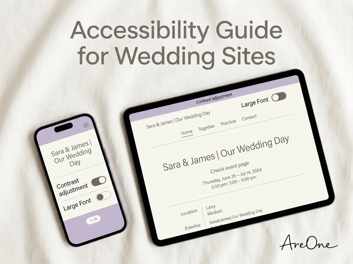
Beyond the size and shape of your letters, the color of your text plays a massive role in readability. A beautiful high contrast design ensures that the text stands out sharply against the background. Light gray text on a white background, while trendy and minimalist, is a nightmare for aging eyes. Instead, opt for stark contrasts: deep charcoal or black text on a soft cream or white background, or very bright white text on a dark, solid background. Avoid pairing colors that vibrate against each other, such as bright red text on a green background, which can cause eye strain.
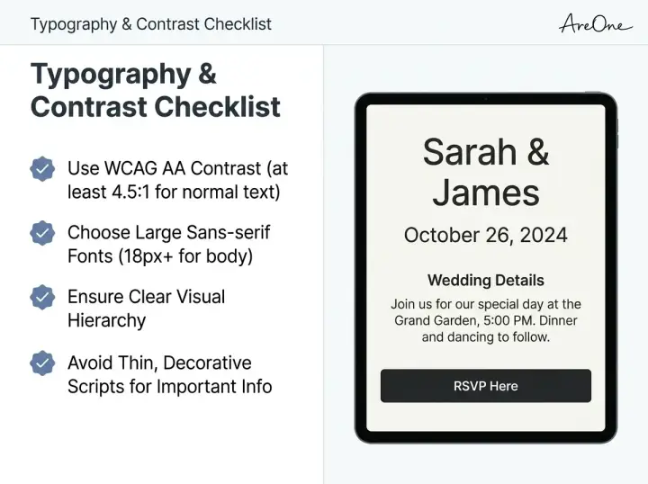
Here is a quick checklist to ensure your typography and colors are perfect for all readers:
- Use sans-serif fonts for all paragraphs, venue details, and RSVP instructions.
- Set your base body font size for older users to a minimum of 16 to 18 pixels.
- Ensure maximum contrast between the text color and the background color.
- Reserve script or calligraphy fonts exclusively for large, primary titles (like your names).
- Ensure the line spacing (leading) is at least 1.5 times the font size to prevent text from looking cramped.
- Avoid placing important text directly over busy background photos without adding a solid color overlay.
Mobile-First Layout: Tap Targets and Spacing
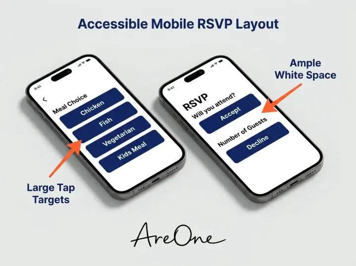
Most of your guests will likely view your digital invite on their smartphones. Therefore, thinking about a mobile-first layout is essential. When older guests use smartphones, they frequently hold the device in one hand and use their index finger to tap the screen, rather than using two thumbs. This means your buttons and navigation links need to be properly sized and spaced. If two links are placed too close together, a guest might accidentally tap the wrong one, leading to confusion and frustration.
To prevent accidental clicks, designers use the concept of 'tap targets'. A tap target is simply the area on the screen that responds when touched. For a mobile-friendly design, buttons should be large enough to be easily tapped without aiming precisely. A good rule of thumb is to make sure every button is at least 44 by 44 pixels in size. Whether it is the button to submit their meal choice or the link to view the hotel block, making these elements chunky and easy to tap will drastically improve the user experience for senior family members.
Recommended ReadingWedding Website Accessibility Checklist (Fonts, Contrast, Layout) →Embracing White Space
do not be afraid of white space. White space, or negative space, is the empty area around your text, images, and buttons. Packing too much information onto a single screen can cause cognitive overload, making it difficult for an older guest to process what they are looking at. By generously spacing out your sections, you give the reader's eyes a chance to rest. Separate your 'Our Story' section from the 'Travel Details' section with ample padding. This visual breathing room helps guide the guest smoothly down the page, ensuring they digest one piece of information at a time.
Language & Readability: Keeping Copy Simple
Browse invitation layouts that fit your plan.
Compare layouts for schedules, travel details, guest guidance, and RSVP information before choosing one for your invitation.



While design and layout are critical, the actual words you use are equally important. You might be tempted to use poetic, flowery language to describe every aspect of your weekend itinerary. However, prioritizing clear, simple language ensures that crucial details are not lost in translation. When writing for a broad audience, it is wise to follow the principles of simple, user-centered writing. This means using short sentences, everyday vocabulary, and active voice. Your goal is to convey logistical information as plainly as possible so that a guest can read it once and understand exactly what is expected of them.
For example, instead of writing, 'We eagerly anticipate your gracious response to our forthcoming nuptial celebration,' simply write, 'Please let us know if you can attend by [Date].' The latter is direct, friendly, and leaves no room for misinterpretation. Keep your paragraphs extremely brief. Break up large walls of text with descriptive subheadings. If a guest is quickly skimming the page to find the address of the reception, a bold subheading labeled 'Reception Address' will help them find it instantly, whereas burying it in a long paragraph will cause unnecessary stress.
Copy-Paste Wording Examples for Clear Communication
To help you get started, we have compiled several examples of clear, accessible wording that you can copy and paste directly into your own pages. These examples are specifically formulated to eliminate confusion while maintaining a warm, welcoming tone.
Example 1: The RSVP Instructions
What to write: 'Please RSVP by October 15th. Click the button below, enter your first and last name, and let us know if you can celebrate with us. You will also be able to select your meal preference.'
Why it works: It provides a clear deadline, explicitly tells the guest what physical action to take (click the button), and informs them of what to expect during the process (entering their name and picking a meal).
Example 2: Dress Code Details
What to write: 'Dress Code: Semi-Formal. We suggest suits and ties for men, and cocktail dresses or elegant pantsuits for women. The ceremony is outdoors on grass, so please choose comfortable shoes. Block heels or flats are recommended.'
Why it works: 'Semi-Formal' can mean different things to different generations. By giving concrete examples of appropriate attire and adding a practical note about the terrain, you remove all guesswork and anxiety for older guests worrying about footwear.
Example 3: Accommodation Information
What to write: 'We have reserved a block of rooms at the Grand Hotel. To receive our discounted group rate, please book your room by September 1st. You can book online using the link below, or call the hotel directly at (555) 123-4567 and mention the Smith/Jones Wedding.'
Why it works: It provides the deadline clearly and, crucially, offers a phone number alternative. Many older guests still prefer making hotel reservations over the phone rather than navigating a third-party booking site.
Common Mistakes Couples Make with Digital Invites
Even with the best intentions, it is easy to make subtle design errors that drastically reduce the usability of your site.
Mistake 1: Relying Exclusively on Icons
Using small icons without text labels is a frequent error. A minimalist icon of a fork and knife might seem like an obvious link to the menu, but to an older guest, it might not be intuitive. Always pair icons with clear text labels. If you have an envelope icon, place the word 'RSVP' directly beneath it. This guarantees that no one is left guessing what a specific button does.
Mistake 2: Overly Complex Multi-Step Forms
When guests click the RSVP button, they should not be met with a daunting, ten-page questionnaire. Asking for mailing addresses, email addresses, song requests, advice for the newlyweds, and dietary restrictions all at once can be overwhelming. Keep your streamlined digital RSVP forms as brief as possible. Ask only for the essential information: attendance, meal choice, and severe allergies. If you need a mailing address for thank-you cards, consider asking for it later or keeping that field strictly optional.
Need a faster RSVP flow?
Use AreOne to collect guest replies, meal choices, and reminders in one clean workflow.
Mistake 3: Text Embedded Inside Images
Couples often upload a gorgeous photo of their printed save-the-date card to their homepage. However, screen readers cannot read text that is trapped inside an image file. when that image is viewed on a small mobile phone, the text shrinks and becomes unreadable. Always type your important details directly into the text editor of your platform, rather than uploading images that contain text.
Mistake 4: Disappearing Navigation Menus
Trendy 'hamburger menus' (the three little horizontal lines) are popular in modern web design, but they can completely hide your website's navigation from users who are not tech-savvy. If an older guest does not know to click those three lines, they might think your homepage is the only page that exists. Whenever possible, use clear, visible navigation bars with actual words like 'Schedule,' 'Travel,' and 'RSVP' pinned to the top of the screen.
Comparing Accessible and Inaccessible Features
To visualize the difference between a frustrating user experience and a joyful one, review this comparison table. Making the switch from the inaccessible column to the accessible column requires very little effort but yields incredible results for your senior loved ones.
| Design Element | Inaccessible Approach (Avoid) | Accessible Approach (Do This) |
|---|---|---|
| Font Style | Using thin script fonts for all paragraphs. | Using bold, legible sans-serif fonts for details. |
| Background | Placing text directly over a busy, textured photo. | Placing text on a solid color block or dark overlay. |
| Navigation | Hiding all page links inside a tiny menu icon. | Displaying clear text links at the top of the page. |
| Form Fields | Using tiny radio buttons placed closely together. | Using large, distinct, tap-friendly selection boxes. |
| Support | Providing only an email address for questions. | Providing a dedicated phone number for tech help. |
How to Test Your Wedding Website for Older Guests
Before you hit the publish button and blast the link to your entire guest list, testing your platform is a mandatory step. The absolute best way to ensure your hub is user-friendly is to conduct a live test with an actual older family member. Ask your grandmother, an older neighbor, or a senior relative to sit down with their smartphone or tablet. Send them the link and simply watch them try to navigate it. Do not guide them or tell them where to click. Observe where they naturally scroll, where they pause, and where they seem confused.
If they struggle to find the registry link or have a hard time clicking the submit button on the RSVP form, take detailed notes. Their genuine interaction with your layout will provide invaluable feedback that no automated tool can match. Once you identify the friction points, you can easily go back into your builder and enlarge a font, tweak a color, or add a more descriptive headline to solve the issue before the official launch.
Utilizing Built-In Tools
If you are building your digital presence with a premium SaaS platform, take advantage of their specialized preview tools. Look for the mobile preview toggle to see exactly how your typography scales down on smaller screens. Choosing beautifully accessible wedding templates right from the start takes the guesswork out of the equation. These curated designs already factor in proper spacing, accessible color palettes, and readable font pairings, ensuring you start with a robust, inclusive foundation.
review your platform's configuration settings to ensure you are selecting options that prioritize ease of use. If you are concerned about your budget while planning, you can explore flexible pricing plans that grant you access to premium tools without breaking the bank. Ensuring everyone feels included should never feel like an unaffordable luxury.
A Welcoming Digital Doorway for Every Guest
Taking the time to refine your digital footprint speaks volumes about your character as a host. It demonstrates deep empathy and respect for the diverse group of people who are traveling, buying gifts, and setting aside their weekend to honor your love story. By prioritizing legibility, clear instructions, and intuitive layouts, you eliminate technical anxiety and replace it with joyful anticipation. Your older family members will feel valued when they realize you considered their comfort during your planning process.
Tying the knot and connecting the dots: building a seamless wedding website for older guests guarantees that from the very first click to the final dance, everyone feels like a cherished part of your celebration.
Frequently Asked Questions
Find quick answers to common questions about this article.

No approved comments yet.