
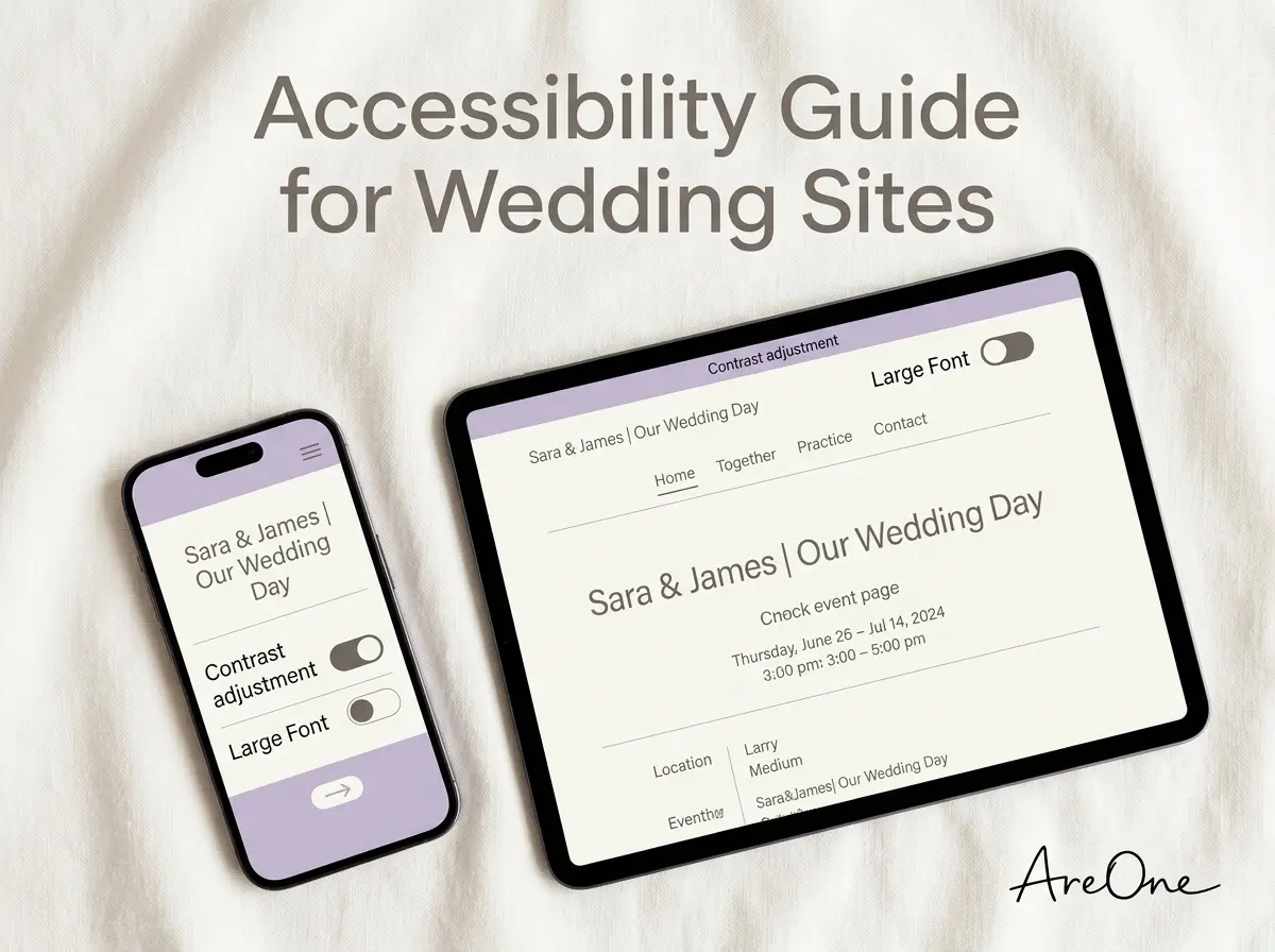
TL;DR: Prioritizing wedding website accessibility ensures that every single guest, from your tech-savvy friends to your elderly grandparents, can read the details, RSVP online, and celebrate your big day without frustration.
Why Wedding Website Accessibility Should Be Your First Step
Getting engaged brings an incredible rush of excitement, followed closely by the reality of coordinating a major event. Creating a beautiful central digital hub for your event details is naturally a top priority. However, many couples unintentionally overlook a critical element during the design process: wedding website accessibility. By designing your digital invitations with every single guest in mind, you guarantee that no one is left confused or frustrated while trying to find your venue.
An accessible digital hub is a welcoming hub. It ensures that everyone you love can access vital information, RSVP on time, and understand the flow of the weekend. We want your guests to focus on the immense joy of your upcoming union, not the struggle of figuring out how to read tiny, light-gray text on a bright white background. Thoughtful, inclusive design simply means creating a digital space that anyone can use, regardless of their physical abilities or technical confidence.
Understanding Accessibility Basics for Wedding Guests
Why do we even need to talk about digital inclusivity for a personal celebration? When you send out your digital invitations, the audience receiving them is diverse. You likely have friends who navigate new technology effortlessly. Conversely, you also have grandparents, older relatives, or friends with varying degrees of visual, cognitive, and motor impairments. Every single one of these individuals deserves a smooth, simpler experience when interacting with your event portal.
To get a solid foundational understanding of these important principles, we recommend reviewing the Web Content Accessibility Guidelines provided by the W3C Web Accessibility Initiative. These internationally recognized standards serve as the absolute gold standard for creating inclusive digital experiences. While you certainly do not need to become a certified web developer to host an event, borrowing their core concepts will radically transform your portal.
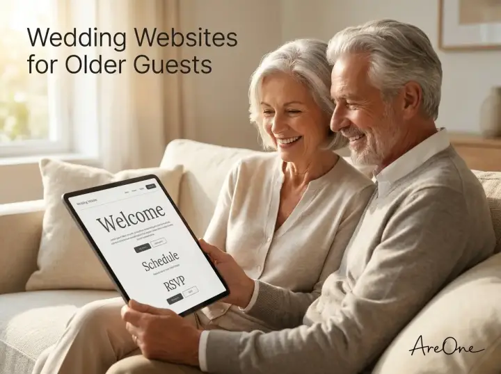
For an even broader overview of how to apply these concepts specifically to event planning, check out our comprehensive guide to making your wedding website easy for older guests. Educating yourself early in the planning process prevents major headaches down the road.
How Inclusivity Directly Benefits You as the Host
Planning a massive event requires managing countless logistical details simultaneously. The absolute last thing you want on your plate is a sudden flood of phone calls, text messages, and emails from guests who cannot figure out how to RSVP. When your online form is broken, confusing, or simply hard to read, your guests will inevitably turn to you for technical support.
Inclusivity directly reduces your stress as a host. Think about the elderly guests attending your celebration. They might use older mobile devices, have vision impairments, or struggle with complex digital navigation paradigms. When you build an inclusive platform from the ground up, you respect their presence. You make them feel valued right from the start, and you free yourself from being an IT support desk on top of being a bride or groom.
Typography & Contrast Checklist for Maximum Legibility
Modern design trends often push for elegant, swooping calligraphy, ultra-thin minimalist typefaces, and muted, pastel color palettes. While these aesthetic choices look undeniably beautiful on physical, printed paper, they frequently create a total nightmare for digital readability. When building your site, your typography and your color choices are your two most critically important tools.
You must strike a delicate balance between a romantic, personalized aesthetic and functional, user-friendly design. This means choosing fonts that render perfectly crisp on screens of all sizes. It also means selecting complementary colors that do not blend into each other under different lighting conditions. Our beautiful, accessible templates are engineered specifically to handle this delicate balance for you.
Choosing the Ideal Font Size for Older Users
Selecting the correct font size for older users is crucial for a successful digital invitation. As humans age, our eyes naturally lose some ability to focus on small, intricate details. A font size that looks perfectly fine and readable to a twenty-something might be illegible to someone in their seventies navigating a glowing screen.
A reliable rule of thumb is to set your foundational base body text to at least 16px to 18px. For critically important details like the event date, the exact start time, and the venue location, consider bumping the size up to 20px or 22px to ensure it cannot be missed. You must fiercely avoid using thin or ultra-light font weights, as these visually disappear on bright mobile screens.
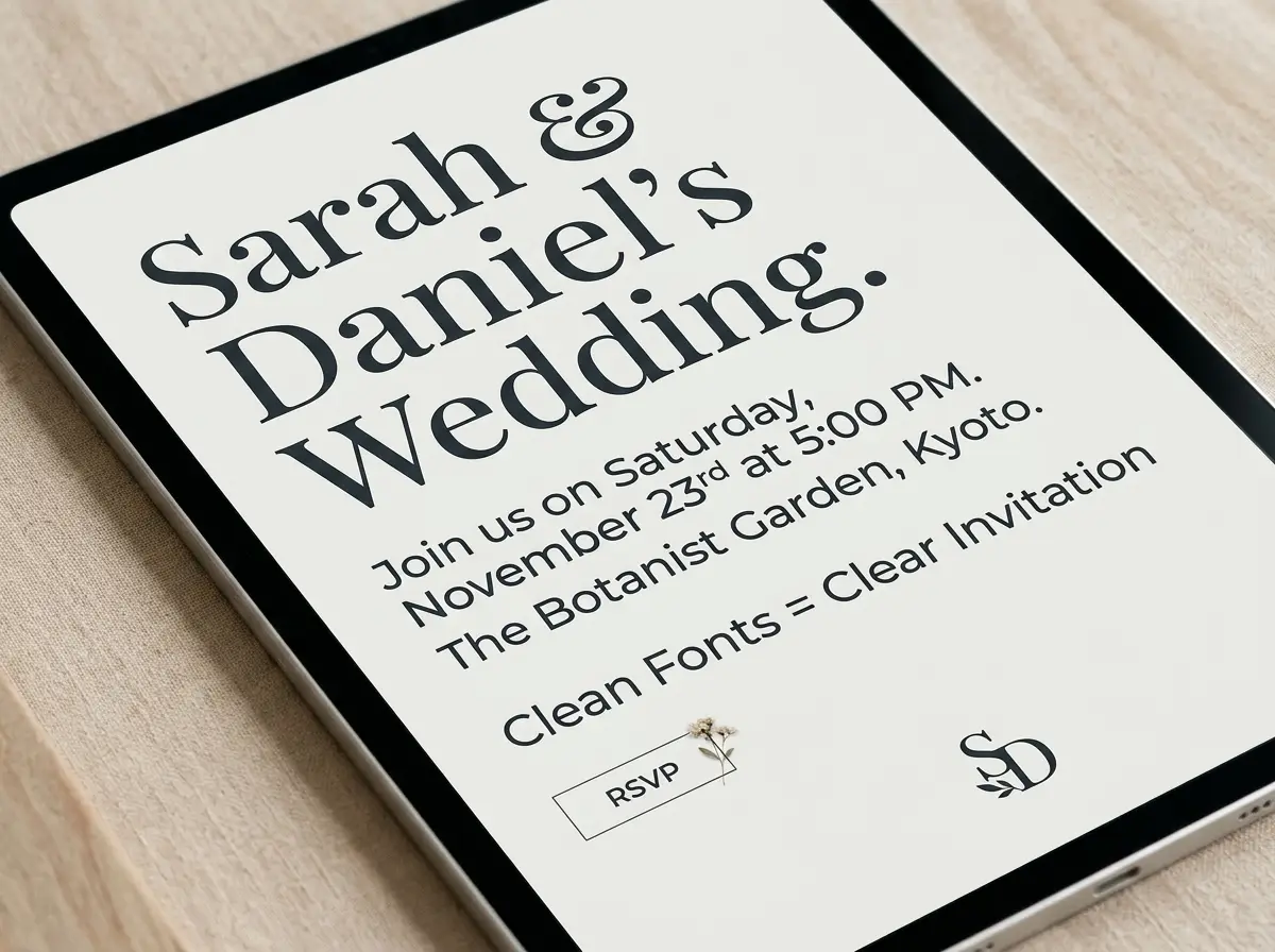
If you feel you must use a romantic script or calligraphy font for aesthetic purposes, limit it strictly to large headers or your names. Never, under any circumstances, use a script font for instructional paragraphs, driving directions, or your digital RSVP form. Stick to clean sans-serif or legible serif fonts for the heavy lifting of communication.
Implementing a Stunning High Contrast Design
A beautifully executed high contrast design is the secret weapon of an inclusive digital experience. Contrast simply refers to the difference in brightness between your text and the background it sits upon. Low contrast combinations—like pale pink text floating on a white background—are nearly impossible to read outdoors in the sun or by individuals with impaired vision.
To achieve an effective high contrast design without sacrificing elegance, pair rich, dark text with a light, soft background, or vice versa. Deep navy, dark charcoal, rich burgundy, and forest green are excellent, elegant alternatives to harsh, pure black. Use these dark, grounding shades on soft cream, warm ivory, or crisp white backgrounds to ensure the text pops beautifully.
You can rigorously verify your color choices using tools provided by organizations like GOV.UK accessibility. Their guidelines provide excellent, practical examples of how proper contrast profoundly benefits all users, especially those attempting to read your schedule in glaring sunlight or dimly lit living rooms.
| Design Element | Avoid These Practices | Best Practices for Accessibility |
|---|---|---|
| Body Font Type | Thin, ultra-light, or complex script fonts | Clean sans-serif (Arial, Open Sans), min 16px |
| Color Pairings | Pale gray text on a bright white background | Dark charcoal or navy text on a warm cream background |
| Hyperlinks | Un-underlined, exact same color as normal text | Bold, clearly underlined, or a highly contrasting color |
| Backgrounds | Busy, highly detailed photo backgrounds behind text | Solid color blocks or dark, semi-transparent overlays |
Mastering a Mobile-First Layout (Tap Targets, Spacing)
It is practically guaranteed that the vast majority of your family and friends will view your digital invitation on their smartphones. Therefore, designing a mobile-first layout is non-negotiable. Mobile screens are inherently small, and navigating them requires a level of physical precision that some older guests or individuals with motor impairments might lack.
When interface elements are crammed too closely together, users will inevitably accidentally tap the wrong link. This frustrating experience leads to lost information, incorrect meal choices, and panicked texts sent directly to you. Give your design plenty of room to breathe. Generous white space (often called negative space) not only looks modern and elegant, but it also significantly improves overall usability.
Optimizing Button Sizing and Clickable Areas
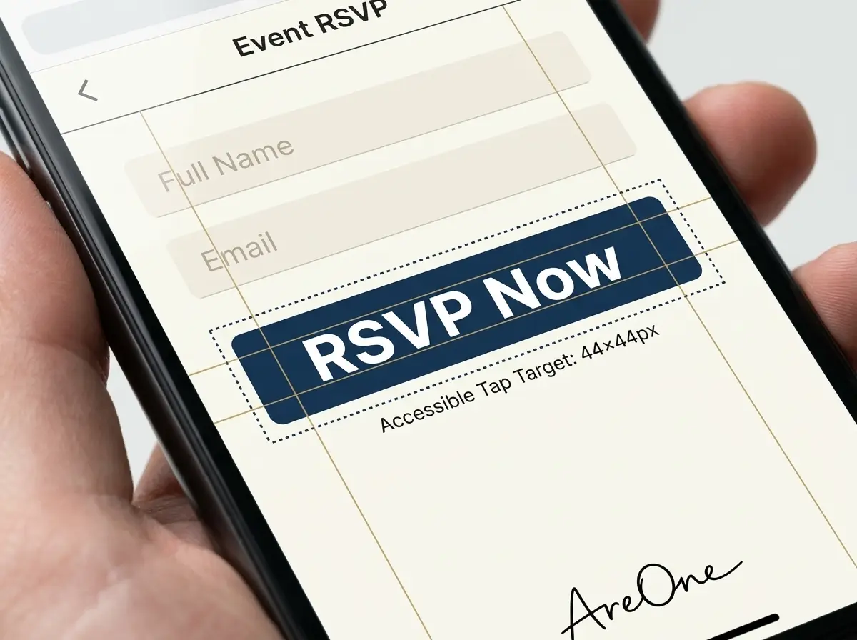
This brings us to the crucial concept of tap targets. A tap target is any area on the digital screen that a user needs to physically touch—like a map link, a menu icon, or the all-important final RSVP button. These specific targets must be large enough to be easily and confidently tapped with an adult thumb without accidentally hitting an adjacent element.
The standard industry recommendation is to maintain a minimum size of 44 by 44 pixels for any clickable element. you must leave ample physical space between interactive buttons. If you have 'Accept' and 'Decline' buttons situated next to each other, separate them significantly to prevent an accidental incorrect response. Our digital RSVP features are strictly built with these exact spacing metrics in mind to guarantee a flawless experience.
Language & Readability: The Power of Simple Copy
Browse invitation layouts that fit your plan.
Compare layouts for schedules, travel details, guest guidance, and RSVP information before choosing one for your invitation.



Even if you possess perfect typography and an impeccable high contrast design, your digital accessibility will completely fail if the language is overly complicated or confusing. Clarity is the ultimate kindness. When communicating vital logistics, always prioritize crystal clear, simple language over long-winded poetic metaphors or confusing inside jokes.
Break your text down into very short, digestible paragraphs. Use bulleted lists for important schedules, specific packing requirements, or detailed dress codes. Keep your sentence structures relatively concise. The ultimate goal is to allow your busy guests to quickly scan the page, find exactly what they need to know, and easily move on with their day.
If you are hosting a diverse crowd, strongly consider the linguistic needs of your entire audience. Providing seamless translations or simple toggles for different languages ensures that everyone understands the weekend itinerary. Explore our powerful multilingual capabilities to easily and beautifully serve all your international loved ones.
Copy-Paste Wording Examples for Clear Communication
Sometimes, simply finding the right words is the absolute hardest part of the planning process. You want to sound warm, welcoming, and inviting without ever losing logistical clarity. Here are a few accessible, perfectly clear wording options that you can copy and paste directly into your platform.
Example 1: The Weekend Schedule
Why this works beautifully: It utilizes a clear bulleted list, features unambiguous times, and explicitly states the exact locations without any extra fluff.
'We cannot wait to celebrate with you! Here is the clear schedule for Saturday:
- 3:30 PM: Guest Arrival at The Botanical Gardens (Main South Entrance).
- 4:00 PM: The Ceremony Begins promptly.
- 5:00 PM: Cocktails and Light Appetizers on the West Patio.
- 6:30 PM: Dinner, Toasts, and Dancing in the Glass Greenhouse.'
Example 2: The Dress Code Explanation
Why this works beautifully: It completely avoids confusing, contradictory terms like 'Beach Formal' and explicitly states exactly what guests should wear for their utmost comfort.
'Dress Code: Semi-Formal.
We want you to be totally comfortable! Please wear cocktail dresses, suits, or nice dress pants. The ceremony takes place on grass, so we strongly recommend wearing block heels, wedges, or flat shoes. A light jacket or shawl is advised for the cool evening breeze.'
4 Common Mistakes Couples Make With Digital Invites
Even with the absolute best intentions at heart, busy couples frequently fall into a few predictable, frustrating traps. Understanding these common mistakes ahead of time will save you countless hours of troubleshooting and guest management later.
Mistake 1: Hiding Information in Huge Paragraphs
Many couples enthusiastically write a beautifully long, romantic story about how they first met, but then they bury the actual event location at the very bottom of that massive text block. Guests who are simply looking for the address to plug into their GPS will give up. Always distinctly separate your romantic narrative from the hard, logistical facts.
Need a faster RSVP flow?
Use AreOne to collect guest replies, meal choices, and reminders in one clean workflow.
Mistake 2: Disabling Pinch-to-Zoom on Mobile Devices
Some third-party templates strictly lock the screen size to rigidly preserve a specific artistic layout. This is a massive, frustrating barrier for accessibility. Users, especially those desperately searching for an appropriate font size for older users, must be able to pinch and zoom in on small maps, tight schedules, and dense text. Never disable this native mobile zooming feature.
Mistake 3: Relying Solely on Color to Convey Vital Information
If you decide to color-code your events (for example, 'Red text means Friday night, Blue text means Saturday afternoon'), you completely exclude colorblind guests who cannot distinguish those hues. Always pair your color cues with clear text labels or distinct, recognizable icons to ensure the message reliably gets across to everyone.
Mistake 4: Overloading the Page with Auto-Play Media
A beautiful, professionally shot video of your engagement is lovely, but if it loudly auto-plays with blasting sound the absolute moment the page loads, it is jarring. it can cause severe issues for individuals utilizing screen reading software. Always give your users the explicit control to press the play button themselves.
Navigating Media and Images Inclusively
Images and videos are an incredible way to showcase your personality and build excitement for the upcoming celebration. However, if these media elements are not optimized properly, they can significantly slow down your page load times and create immense barriers for users relying on assistive technologies.
When uploading large, beautiful engagement photos, always ensure they are compressed for web viewing. A page that takes thirty seconds to load on a mobile data connection is inherently inaccessible to guests who might not have access to high-speed broadband or stable Wi-Fi. Optimization is key to a smooth experience.
The Critical Importance of Alt Text for Images
Alternative text, commonly known as alt text, is a hidden, written description of an image. Screen reading software reads this text aloud to visually impaired users, allowing them to understand the visual context of the page. Without alt text, a screen reader will simply announce 'image,' leaving the user completely in the dark.
When adding photos of your gorgeous venue or helpful maps of the surrounding area, take ten seconds to write a clear, descriptive alt text. Instead of writing 'photo1.jpg,' write something like 'A beautifully illustrated map showing the walking path from the main hotel to the lakeside ceremony site.' This tiny effort makes a world of difference.
The Essential Wedding Website Accessibility Checklist
To ensure you successfully cover all of your bases, we have compiled a definitive, easy-to-use checklist. Diligently run through this specific list before you confidently hit the publish button on your digital invitations.
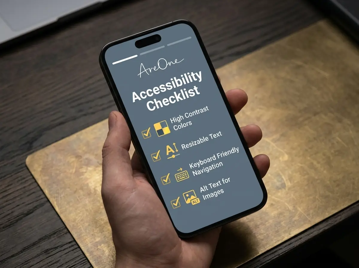
- Font Legibility Check: Ensure your base text is at least 16px to 18px, and strictly avoid script fonts for any essential logistical information.
- High Contrast Verification: Double-check that your text color stands out starkly and clearly against the chosen background color in all lighting conditions.
- Mobile Layout Testing: Vigorously test the site on your own smartphone to guarantee all interactive buttons are easily tappable with a single thumb.
- Clear Navigation Paths: Ensure the main menu is incredibly easy to locate and the primary RSVP button is prominently, centrally displayed.
- Descriptive Alternative Text: Add clear, highly descriptive alt text to all essential images, especially maps, venue photos, and important graphical icons.
- Simple, Direct Language: Thoroughly review your written text to guarantee sentences are short, sweet, and all logistics are remarkably straightforward.
- Pinch-to-Zoom Capability: Confirm that your mobile site allows users to smoothly zoom in on the content comfortably without breaking the layout.
The Value of Real-World Testing Before Launch
Do not simply trust your own eyes when evaluating your digital creation. Before you proudly send out the official link to your entire guest list, privately send a test version to a few uniquely selected people. Choose a tech-savvy friend to vigorously test the mobile RSVP flow for bugs.
More importantly, send it to an older relative, like a parent or grandparent, to verify the readability. Listen to their honest feedback carefully. If your grandmother mentions that the date was a bit hard to find, immediately increase the text size and adjust the contrast. Real-world testing is unequivocally the most effective way to guarantee true accessibility.
Making Your Wedding Website Accessibility Ready for the Aisle
Prioritizing a seamless, wonderfully inclusive digital experience is a profound act of love and deep respect for your friends and family. By diligently ensuring your typography, color contrast, and layout spacing are perfectly optimized, you remove digital barriers and warmly welcome every single guest with open arms.
Creating a beautiful space that accommodates everyone takes only a little extra thought, but it yields immense peace of mind. We sincerely hope this comprehensive guide helps you realize that successfully mastering your wedding website accessibility is simply the perfect first step down the aisle.
Frequently Asked Questions
Find quick answers to common questions about this article.
No approved comments yet.