
TL;DR: Discovering the optimal image dimensions and knowing exactly what details to include ensures your digital invites load beautifully and keep your guests completely informed without any unnecessary tech-related stress.
Creating a centralized digital hub for your special day is an exciting milestone in the planning process. You get the wonderful opportunity to share your love story, formalize your headcounts, and showcase those beautiful engagement pictures. However, large image files can cause your pages to load at a sluggish pace. This can be frustrating for your older guests or those trying to access your details via weak mobile data connections.
Understanding the absolute best photo size wedding website platforms require is the hidden secret to providing a fast, smooth, and accessible experience. Finding the perfect balance between high-quality visuals and lightning-fast loading speeds is essential. Nobody wants to stare at a completely blank screen while waiting for an enormous engagement portrait to slowly render line by line.
We are here to help you navigate the nuances of image compression, necessary text inclusions, and intuitive layouts. By following these calm, clear guidelines, you will create a digital space that looks gorgeous and functions flawlessly for everyone on your guest list.
What Guests Expect to Find on a Fast Scan
When you invite your friends and family to view your digital space, it is crucial to remember how human beings actually browse information online. Very few people sit down to read every single paragraph like a novel. Instead, the vast majority of your guests will quickly scan the screen. They are actively hunting for the most vital pieces of information: dates, times, and specific locations.
This scanning behavior is especially true for your older relatives, who might find navigating complex digital menus a bit overwhelming. Keeping your design clean, your fonts large, and your primary details front and center will prevent a barrage of confused text messages asking where the ceremony is being held. Clarity is the ultimate form of modern hospitality.
Before you begin designing, understanding exactly what to put on wedding website pages will act as your guiding roadmap. The visual hierarchy of your information matters deeply. The most critical event details should naturally catch the eye before the guest even has to scroll down the page. Simplicity always wins.
Designing for Small Screens and Mobile Devices
It is likely that over eighty percent of your invitees will check your site on their smartphones. They might be sitting in a coffee shop, riding the train, or quickly verifying the address while sitting in their car on the way to your venue. This reality makes mobile responsiveness vital to the overall guest experience.
Because mobile screens are narrow, massive blocks of text can appear daunting. You must write short, punchy paragraphs. uploading massive, uncompressed image files will immediately destroy mobile loading speeds, causing the browser to freeze or crash. Keeping file sizes small guarantees a seamless viewing experience on any device.
For more detailed foundational steps on structuring your layout, we recommend reading our ultimate wedding website checklist. It provides a comprehensive roadmap for everything you need to build a reliable digital experience.
Optimizing the Best Photo Size Wedding Website Dimensions
The technical side of your digital invitations does not need to be intimidating. Getting your image dimensions correct from the very beginning will save you hours of frustrating adjustments later. Different areas of your layout require different aspect ratios to look their absolute best. A wide banner image needs completely different dimensions than a square gallery thumbnail.
We have carefully compiled a helpful reference chart to guide your formatting process. Following these exact specifications will ensure your site remains visually stunning without sacrificing loading speed. Remember, consistency is the key to achieving a polished, professional appearance.
[Insert Image Here: Alt text containing best photo size wedding website guidelines and dimensions chart]
Below is a clear breakdown of the ideal dimensions, aspect ratios, and maximum file sizes you should aim for when exporting your beautiful photography.
| Website Element | Recommended Dimension | Ideal Aspect Ratio | Maximum File Size |
|---|---|---|---|
| Main Hero Banner | 1920 x 1080 pixels | 16:9 (Landscape) | Under 500 KB |
| Photo Gallery Image | 1080 x 1080 pixels | 1:1 (Square) | Under 300 KB |
| Bridal Party Portraits | 800 x 1000 pixels | 4:5 (Vertical) | Under 250 KB |
| Background Textures | 2000 x 2000 pixels | Any | Under 400 KB |
If you attempt to upload the raw, high-resolution files provided directly by your photographer, you will undoubtedly experience severe lag. Those raw files are often larger than ten megabytes each. Always resize them according to the chart above before you hit the upload button.
Image Compression Tools and Proven Techniques
Resizing the actual dimensions of your image is only the first half of the optimization process. The second half involves file compression. Compression removes unnecessary hidden data from the image file without visibly altering the quality to the naked eye. This step is mandatory for digital performance.
You do not need expensive software to achieve excellent compression. There are numerous free, browser-based tools available online, such as TinyPNG or JPEGmini, that handle this process beautifully. Simply drag and drop your resized photos into these tools, and they will dramatically reduce the file weight.
When saving your final images, consider using modern file formats like WEBP instead of traditional JPEGs if your builder supports it. WEBP files offer rich color profiles while maintaining significantly smaller file sizes, ensuring your digital aesthetic remains completely uncompromised.
Must-Have Wedding Website Sections
When evaluating different wedding website sections, there is a clear distinction between what is mandatory and what is simply nice to feature. Your core pages act as the central nervous system of your entire event. If these sections are confusing or missing, your guests will undoubtedly feel anxious and under-informed.
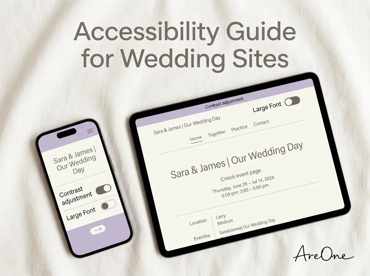
[Insert Image Here: Alt text showing mobile-friendly wedding website sections displayed on a smartphone]
The most critical element is your main schedule. Outline exactly when and where each event takes place. Provide clear start times, and consider noting when the doors actually open to prevent awkward early arrivals. Pair this schedule with an integrated map featuring clickable directions.
Another absolute must-have is a comprehensive Frequently Asked Questions page. This is where you address logistical concerns that do not neatly fit on the main invitation. You should cover parking availability, transportation options, accessibility accommodations, and specific dietary request procedures.
Recommended ReadingWedding Website FAQ: Questions Guests Actually Ask →Simplifying the Digital RSVP Experience
Your RSVP mechanism is arguably the most vital interactive feature you will implement. It must be completely frictionless. Guests should be able to instantly locate the RSVP button, enter their name, and securely lock in their attendance and meal choices within sixty seconds.
Avoid forcing your guests to create complicated user accounts or passwords just to reply. The process should feel welcoming and intuitive. By utilizing seamless digital RSVP features, you can automatically track headcounts and dietary restrictions in real-time, removing a massive administrative burden from your shoulders.
Nice-to-Have Wedding Website Sections
Once you have secured the mandatory functional pages, you can begin adding elements that infuse your digital hub with deep personal charm. These secondary sections allow your personalities to shine through, transforming a basic informational page into a beautiful digital keepsake.
Sharing your love story is a wonderful addition, especially for extended family members who may not know how you originally met. Keep this narrative relatively brief, lighthearted, and focused on your shared journey. A few short paragraphs detailing your engagement are always a crowd-pleaser.
building a dedicated registry page is recommended, though technically optional. Rather than listing registry links directly on the formal invitation—which can sometimes feel a bit forward—placing them gently on a dedicated digital page provides a polite, low-pressure way for guests to find your selected gifts.
Showcasing Your Engagement Photo Gallery
A digital gallery is the perfect place to highlight those breathtaking engagement portraits you invested in. However, you must apply the image optimization rules we discussed earlier. A massive gallery containing thirty uncompressed photos will crash older devices instantly.
Curate your selection carefully. Choose ten to fifteen of your absolute favorite shots rather than uploading the entire album. This curated approach feels far more intentional and elegant, ensuring a premium browsing experience for your loved ones.
Essential Wedding Website Wording Tips
Nailing your wedding website wording is an art form. The tone you set digitally will serve as the opening act for the entire celebration. You want to sound warm and appreciative, yet simultaneously firm and precise regarding important boundaries and logistical deadlines.
Browse invitation layouts that fit your plan.
Compare layouts for schedules, travel details, guest guidance, and RSVP information before choosing one for your invitation.



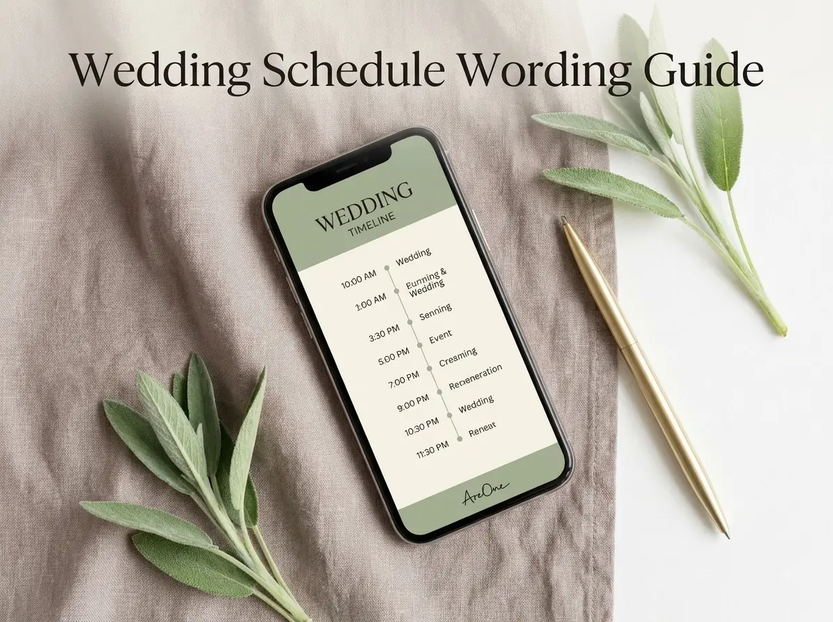
[Insert Image Here: Alt text demonstrating clear wedding website wording on a digital invitation template]
Always utilize an active voice and keep your sentences delightfully brief. If you are hosting a diverse guest list with family members joining from overseas, clarity becomes even more paramount. Avoid overly complex metaphors or regional slang that might not translate well across different cultures or age groups.
If you are planning an international celebration, providing instructions in multiple languages is an incredible gesture of hospitality. Exploring multilingual options ensures that every single guest feels respected and perfectly informed, regardless of their native language.
Copy-Paste Wording Examples
Staring at a blank screen can definitely induce writer's block. To assist you in crafting the perfect tone, we have designed several copy-paste templates. You can easily adapt these snippets to match the specific vibe of your upcoming celebration.
The Warm Welcome (Casual):
"We are so thrilled to celebrate our special day with you! This digital space contains all the essential details you will need, from hotel blocks to weekend schedules. Please take a look around, and do not forget to RSVP by [Date]. We cannot wait to dance the night away with our favorite people!"
Need a faster RSVP flow?
Use AreOne to collect guest replies, meal choices, and reminders in one clean workflow.
The Adults-Only Boundary (Graceful):
"While we adore your little ones, we have chosen to keep our ceremony and reception an adults-only affair. We sincerely hope this advance notice allows you to secure a babysitter and enjoy a well-deserved, relaxing night out with us!"
The Unplugged Ceremony Request (Firm but Polite):
"We invite you to be present with us during our vows. Please kindly turn off all mobile phones and cameras during the ceremony. We have hired an incredible photographer to capture these moments, and we promise to share all the beautiful images with you afterward!"
Understanding the expert advice from Brides regarding tactful communication can further elevate your messaging strategy, helping you navigate delicate topics with absolute grace.
4 Common Mistakes Couples Make
Even the most meticulously organized couples can occasionally overlook crucial digital details. Being aware of these frequent pitfalls will help you sidestep unnecessary stress and ensure a completely flawless execution of your digital strategy.
Mistake 1: Uploading Massive, Uncompressed Files.
We cannot emphasize this enough. Ignoring the guidelines for the optimal photo dimensions is the single most frequent error we see. It directly causes slow load times, high bounce rates, and frustrated guests who abandon the page before reading the actual details.
Mistake 2: Hiding the Final RSVP Deadline.
Your cutoff date must be visible. Do not bury it at the bottom of a lengthy paragraph. Place it prominently on the homepage and at the very top of the RSVP form. Ambiguity leads to late responses, which severely complicates your catering headcounts.
Mistake 3: Providing Vague Dress Codes.
Terms like 'snappy casual' or 'creative formal' might sound fun, but they confuse guests. Stick to universally understood terminology like 'Black-Tie Optional,' 'Cocktail Attire,' or 'Semi-Formal.' Providing specific examples of acceptable outfits completely eliminates guest anxiety.
Mistake 4: Forgetting Mobile Accessibility.
Designing exclusively on a large desktop monitor often leads to text that is far too small when viewed on a cellular device. You must preview your design on a smartphone before you hit publish. For additional insights on user-friendly digital layouts, reviewing the helpful recommendations by The Knot is always a wise choice.
The Pre-Publish Quality Assurance Checklist
Before you confidently share your customized link with your entire social circle, you must conduct a thorough quality assurance check. Treating your digital launch with the same level of care as sending a physical envelope guarantees a perfectly smooth experience.
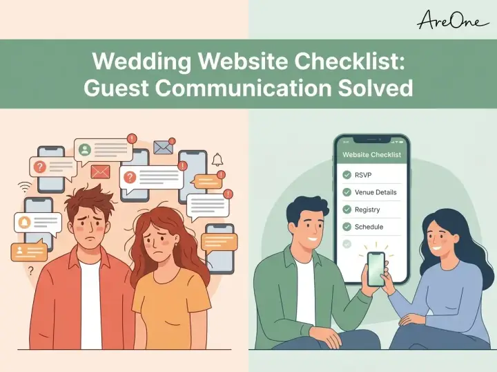
[Insert Image Here: Alt text highlighting the RSVP flow and checklist on a smartphone screen]
Take a quiet evening to carefully review every single page. It is beneficial to ask a trusted friend or a parent to navigate the site independently. Fresh eyes will quickly spot missing links, confusing terminology, or minor typographical errors that you may have glossed over.
Use this comprehensive final checklist to verify your readiness:
- Have you strictly adhered to the size charts for all uploaded imagery?
- Is the RSVP deadline prominently displayed in a high-contrast font?
- Do all external links to hotel blocks and Google Maps function correctly?
- Have you personally tested the RSVP submission flow from a mobile phone?
- Are the start times for the ceremony and reception entirely accurate?
- Have you clearly defined the dress code to prevent guest confusion?
- Is your frequently asked questions section comprehensive and reassuring?
If you are ready to begin drafting your design and want to explore beautifully optimized layouts, we invite you to browse our modern templates. We have meticulously crafted these designs to ensure they look spectacular while maintaining peak digital performance.
Picture-Perfect Readiness
By focusing the lens carefully on the best photo size wedding website approach, you are actively ensuring that your digital experience remains beautifully sharp, fast, and simpler. Proper preparation and gentle communication will undoubtedly set a magnificent tone for your approaching celebration.
Frequently Asked Questions
Find quick answers to common questions about this article.
No approved comments yet.