
TL;DR: Building a thoughtful wedding website FAQ and structuring your pages clearly will save you from endless text messages and create a simpler experience for your guests.
Planning a wedding is a joyous milestone, but the sheer volume of logistics can sometimes feel overwhelming. You have poured your heart into choosing the perfect venue, selecting a beautiful color palette, and curating an unforgettable menu. Yet, as the big day approaches, your phone starts buzzing constantly. Your loved ones are excited, but they have questions. Lots of questions.
This is where a well-crafted wedding website FAQ becomes your absolute best friend. By anticipating what your family and friends need to know, you can provide all the essential details in one beautiful, accessible place. It acts as a digital concierge, gently guiding everyone through the schedule, travel arrangements, and dress codes.
Creating this central hub is not just about sharing information; it is an act of hospitality. When you clearly outline what to put on a wedding website, you empower your loved ones to prepare confidently. They can book their flights, arrange childcare, and pick out their outfits without second-guessing.
Our goal is to help you design an online presence that is functional, elegant, and reassuring. We will walk through the exact wedding website sections you need, provide clear wording templates, and share tips for keeping the process completely simpler. Let us begin building a beautiful digital space for your celebration.
What Guests Expect to Find (Fast Scan)
When a friend or family member receives your stunning digital invitation, their first instinct is to click the link and look for the most vital information. They are usually scanning for dates, times, and locations before they do anything else. You want to make this discovery process as frictionless as possible.
Guests are generally not reading your site like a novel. They are hunting for specific data points to figure out if they can attend and what it will require of them. Keeping this user behavior in mind changes how you approach the design and layout of your pages.
The Mindset of a Wedding Guest
Understanding the mindset of your attendees is crucial. Grandparents might be wondering about parking accessibility, while your college friends are trying to figure out if they get a plus-one. Both groups need straightforward answers immediately. They do not want to hunt through multiple pages to find the address of the reception.
By prioritizing the most critical details on the homepage, you immediately put everyone at ease. A clean, organized layout demonstrates that you value their time and comfort. It sets a welcoming tone for the entire event before they even pack their bags.
Mobile-First Viewing Habits
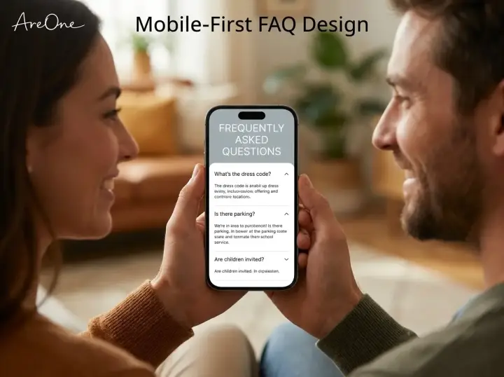
Most of your family and friends will view your digital hub on their smartphones, likely while waiting in line for coffee or sitting on the train. This means large blocks of text are your enemy. You must embrace a mobile-first philosophy when writing and designing.
Use plenty of white space, large readable fonts, and clear headings. Ensure buttons are easy to tap with a thumb. By keeping the interface clean and the sentences short, you accommodate elderly guests and busy professionals alike, ensuring everyone has a seamless reading experience.
Must-Have Wedding Website Sections
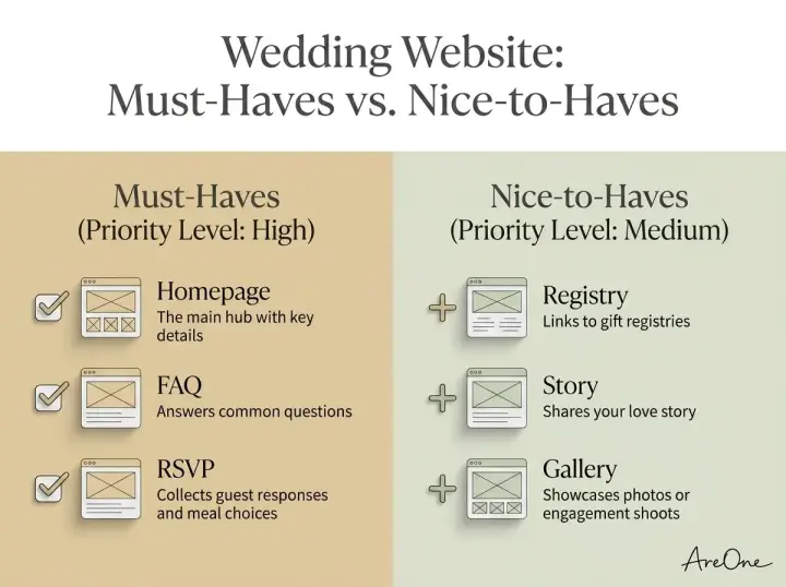
To build an effective digital hub, certain elements are completely non-negotiable. These are the core building blocks that turn a pretty page into a functional tool. If you are wondering what to put on a wedding website, start right here with these essential pillars.
These core pages should be easily visible in your main navigation menu. Do not bury them under obscure titles. Use universally understood labels like 'Schedule', 'Travel', 'RSVP', and 'Questions'. Clarity always wins over cleverness when it comes to navigation.
The Indispensable Wedding Website FAQ
The question-and-answer page is arguably the most valuable real estate on your entire digital platform. This is where you address the granular details that do not naturally fit on a formal invitation. It is your opportunity to set boundaries gracefully and clarify expectations without sounding harsh.
Think of the text messages you have already received. Have people asked about the dress code? Have they inquired about transportation? Gather these real-world inquiries and turn them into your first draft. For more expert etiquette tips for wedding websites, Brides.com offers excellent foundational advice.
Map and Travel Information
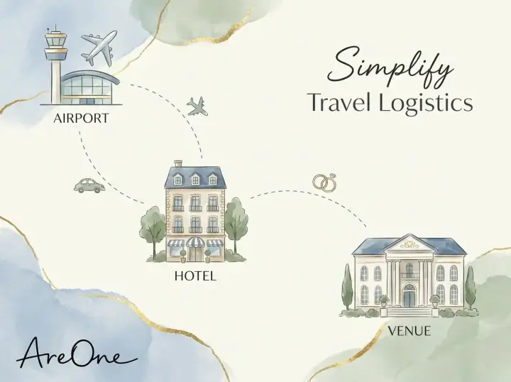
Visualizing travel logistics is helpful. Your guests are stepping out of their daily routines to celebrate you, sometimes traveling across the country or even internationally. Providing a clear map alongside detailed travel information reduces their cognitive load significantly.
Explain parking situations, shuttle bus timings, and whether they need to navigate tricky dirt roads to reach a rustic venue. Recommend specific hotels at various price points. It shows immense hospitality and ensures everyone arrives on time, relaxed, and ready to celebrate.
The Digital RSVP Experience
The days of waiting for physical response cards to arrive in the mail are happily behind us. A dedicated response page is an absolute must-have. It streamlines your headcount tracking and makes replying easy for everyone on your list.
Ensure the form captures dietary restrictions and plus-one names clearly. If you are hosting multiple events, such as a welcome dinner or a farewell brunch, allow guests to reply to each event individually. Discover how our digital RSVP experience simplifies this entire process for you and your attendees.
To help you prioritize, here is a quick breakdown of what to include.
| Feature / Section | Priority Level | Purpose |
|---|---|---|
| Homepage (Date, Time, Venue) | Absolute Must-Have | Immediate fast-scan details. |
| FAQ Page | Absolute Must-Have | Answering common guest inquiries. |
| Digital RSVP Tab | Absolute Must-Have | Collecting accurate headcounts. |
| Travel & Lodging | Must-Have | Assisting with logistics and hotel blocks. |
| Gift Registry Link | Nice-to-Have | Providing gifting options tactfully. |
| Our Story / Photos | Nice-to-Have | Adding a personal, romantic touch. |
Nice-to-Have Sections (Registry, Photos, Stories)
Once the critical logistics are handled, you can sprinkle in elements that showcase your unique personality as a couple. These sections are not strictly necessary for survival, but they add beautiful context and warmth to the digital experience.
Think of these pages as the digital equivalent of mingling with your loved ones. It is a space to share joy, reflect on your journey, and build anticipation for the joyous celebration ahead.
Sharing Your Love Story
Your extended family or childhood friends might not know how you and your partner met. A brief, charming 'Our Story' section bridges that gap. Keep it light, romantic, and relatively brief. A few paragraphs highlighting your first date, the proposal, and what you love about each other is perfect.
Pair this text with a few high-quality engagement photos. Visuals break up the text and give distant relatives a lovely update on your lives. Just remember to optimize the image sizes so the page loads instantly on mobile networks.
Tactful Registry Details
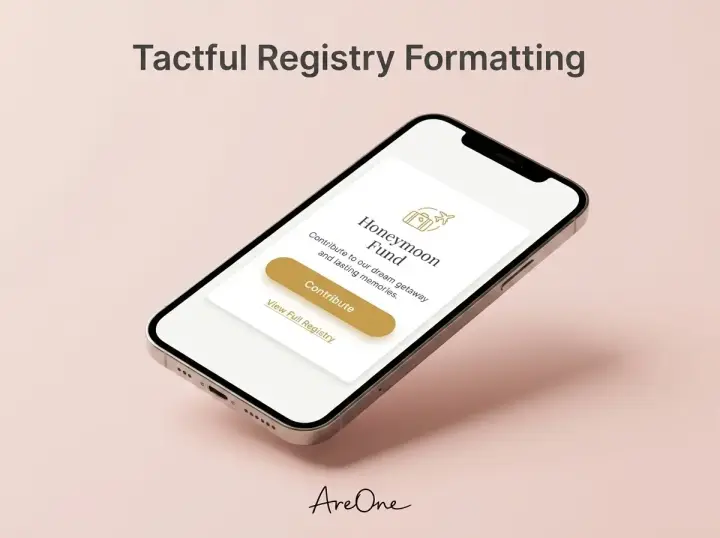
Etiquette historically dictates that registry information should not be printed directly on a formal paper invitation. Your digital platform is the perfect, polite place to share these links. Dedicate a specific tab to your registries, whether you are asking for traditional physical gifts or contributions to a honeymoon fund.
A brief introductory sentence expressing gratitude goes a long way here. Something simple like, 'Your presence at our celebration is the greatest gift we could ask for. However, if you wish to honor us with a gift, we are registered at the following places.'
Crafting the Perfect Copy
Writing for a broad audience requires a delicate balance. You want to sound like yourself, but you also need to be universally understood. Your wedding website wording should be warm, inviting, and crystal clear. Avoid overly flowery language that obscures the actual details.
When writing your text, read it out loud. Does it sound like something you would say to a friend over coffee? If it sounds too rigid or overly formal, soften the edges. Use active voice and address the reader directly using words like 'you' and 'we'.
Copy-Paste Wording Examples
Browse invitation layouts that fit your plan.
Compare layouts for schedules, travel details, guest guidance, and RSVP information before choosing one for your invitation.



Staring at a blank screen can be intimidating. To jumpstart your writing process, we have created several templates you can copy, paste, and adapt for your own pages. These examples are designed to handle potentially awkward topics with immense grace.
Example 1: Unplugged Ceremony
'We invite you to be present with us during our ceremony. Please turn off all phones and cameras and enjoy this special moment with us. We have hired amazing professional photographers and promise to share all the beautiful images with you afterward!'
Example 2: Adult-Only Celebration
'While we adore your little ones, our wedding will be an adults-only event so that everyone can relax and enjoy the evening. We appreciate you making arrangements ahead of time and leaving the kids at home so you can celebrate with us.'
Example 3: Dress Code Expectations
'We would love to see our family and friends get dressed up for our big day! The dress code is Cocktail Attire. Ladies can wear knee-length, tea-length, or midi dresses. Gentlemen can wear a suit and tie. Please note the ceremony is on grass, so choose your footwear accordingly.'
Example 4: Cash Fund Request
'We are so lucky to already have a home full of everything we need. Instead of a traditional registry, we have set up a honeymoon fund. If you would like to contribute to our first adventure as a married couple, you can do so here. Your presence is enough, and we are so grateful for your love.'
Example 5: Transportation Details
'To ensure everyone can celebrate safely, we have arranged a shuttle service between the main hotel block and our venue. Shuttles will depart the hotel lobby promptly at 3:30 PM. Return shuttles will run every hour starting at 9:00 PM.'
Writing Tips: Short, Clear, and Mobile-First
We cannot emphasize enough the importance of brevity. Your loved ones are reading on tiny screens. If they encounter a massive wall of text, their eyes will glaze over, and they will likely text you the exact question you just spent an hour answering online.
Use bullet points wherever possible. Break long paragraphs into two or three shorter ones. Use bold text to highlight crucial information like times, dates, and locations. The easier it is to scan, the more effective your communication will be.
Mastering Wedding Website Wording
Your tone sets expectations for the entire event. If you are hosting a formal black-tie gala in a historic ballroom, your language should reflect that elegance. If you are throwing a casual beach bash with food trucks, your tone should be breezy, fun, and relaxed.
Consistency is key. Do not mix hyper-formal phrasing with casual slang on the same page. Pick a lane and stick to it. For inspiration on the wedding website sections guests care about most, The Knot shares fantastic industry insights.
Need a faster RSVP flow?
Use AreOne to collect guest replies, meal choices, and reminders in one clean workflow.
Knowing What to Put on a Wedding Website (And What to Leave Off)
While it is tempting to share every single detail of your planning journey, restraint is necessary. Do not include events that are exclusive to a small group, such as the rehearsal dinner or the bachelorette party, on the public-facing pages. This prevents confusion and avoids hurting the feelings of those not invited to those specific side events.
Keep the main pages focused strictly on information that applies to all invited attendees. If you need to communicate private events, use targeted digital messages or create hidden, password-protected pages meant only for the bridal party.
Common Mistakes Couples Make with Their Wedding Sites
Even with the best intentions, it is easy to stumble into a few digital pitfalls. Building an online hub is a unique task, and most people only do it once. Recognizing these common errors early will save you time and frustration down the road.
Your future self will thank you for being proactive.
Mistake 1: Hiding the RSVP Button
Your response button should be the most prominent element on your platform. Do not bury it in a submenu or place it at the very bottom of a long scroll. Put a clear 'RSVP Here' button on the main navigation bar and right in the center of the homepage. Make it impossible to miss.
Mistake 2: Forgetting Timezones
If you are hosting a destination event, clearly state the timezone for every single event on the schedule. Guests flying in from different coasts can easily get confused by local start times. Adding a simple 'EST' or 'PST' next to your ceremony time eliminates all ambiguity.
Mistake 3: Overwhelming Text Blocks
As mentioned earlier, long paragraphs are a barrier to understanding. We often see couples write exhaustive histories of their venue or detailed essays about their relationship. While charming, it buries the logistical information. Edit ruthlessly. If a detail does not help a guest attend your event, cut it.
Mistake 4: Neglecting Elderly Guests
Accessibility matters. Using a light grey font on a white background might look chic and minimalist, but it is impossible for older relatives to read. Ensure high contrast between your text and background colors. If you have guests from overseas, consider utilizing multilingual invites to accommodate everyone comfortably.
QA Checklist Before You Publish
Before you hit the final publish button and send the link to hundreds of people, you need to perform a thorough quality assurance check. Treat this like proofreading a vital document. A tiny typo in the venue address can cause massive headaches on the big day.
Grab your partner, a trusted bridesmaid, or a detail-oriented friend, and run through this final checklist together. Fresh eyes will catch mistakes you might have overlooked.
- Is the date and exact start time correct on the homepage?
- Does the venue address match exactly what is listed on Google Maps?
- Are all external links (hotels, registries) working correctly?
- Have you tested the site on both a desktop computer and a smartphone?
- Is the RSVP form capturing dietary requirements?
- Are your custom wording examples free of spelling and grammar errors?
- Is the dress code clearly defined?
- Have you addressed parking and transportation logistics?
- If needed, is the password protection functioning correctly?
- Have you reviewed the final comprehensive wedding website checklist to ensure nothing was missed?
Frequently Asked Questions Addressed
We know that managing an event of this scale requires immense patience and organization. By anticipating needs and providing clear answers, you elevate the entire experience for your cherished family and friends. You transform a potentially chaotic planning phase into a smooth, joyful journey.
Frequently Asked Questions
Find quick answers to common questions about this article.

No approved comments yet.