
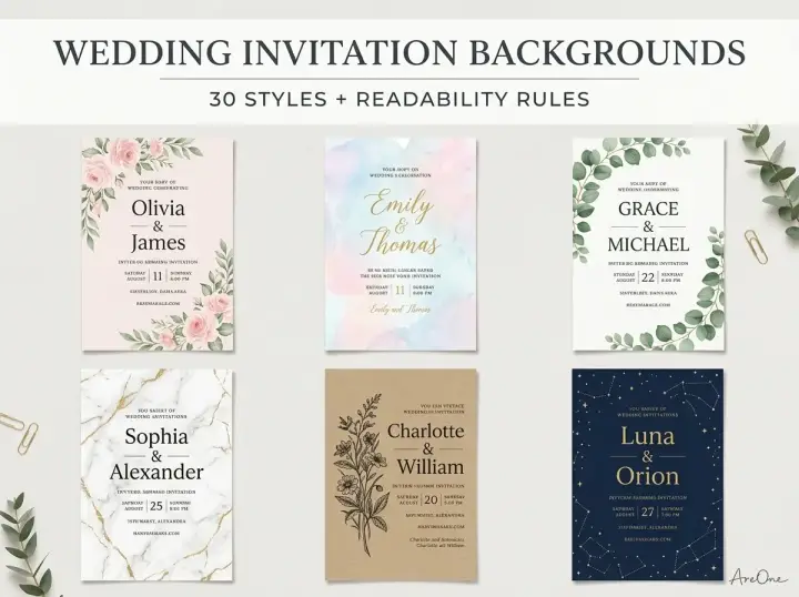
TL;DR: Pick a wedding invitation background that matches your theme, keep the area behind your words calm, and check that your text colour reaches at least a 4.5:1 contrast ratio so every guest can read it.
A wedding invitation background sets the mood before anyone reads a word. Soft florals say garden party, black marble says evening glamour. But a beautiful background can also hide the date, venue and RSVP details if the text sits in the wrong place.
Below are 30 styles, each with a note on where text should go, followed by theme ideas, contrast rules, file sizes and templates.
30 background styles (visual gallery)
Good wedding invitation background design always leaves a quiet zone for text, and each caption tells you where it is. Pick two or three favourites. This article covers backgrounds only; for layouts, motifs and full looks, see our guide to wedding invitation designs.
Floral backgrounds
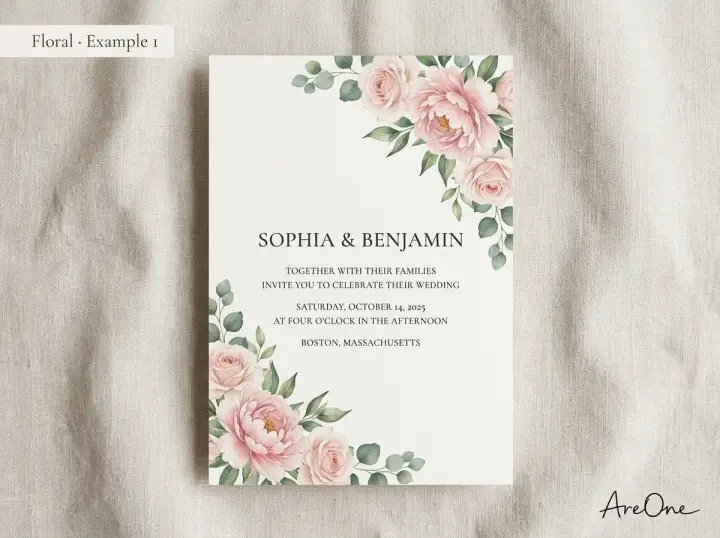
1. Blush peony corners. The open centre holds names and date in charcoal type.
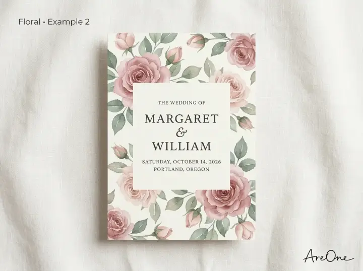
2. Full-bleed garden roses. Busy and romantic; always set text on a solid panel.
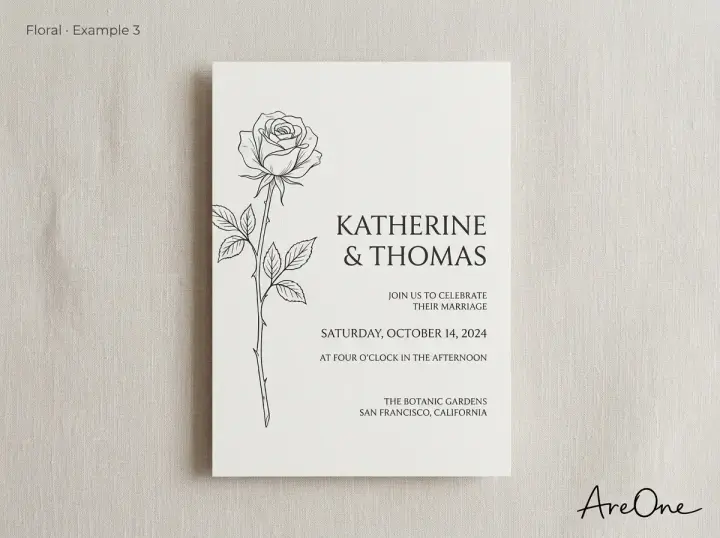
3. Single-stem line drawing. Very quiet; text can sit beside the stem.
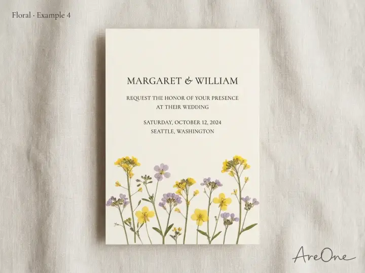
4. Pressed wildflowers. Keep wording in the top two-thirds.
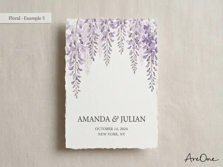
5. Cascading wisteria. The fade leaves a clean lower half.
Watercolor backgrounds
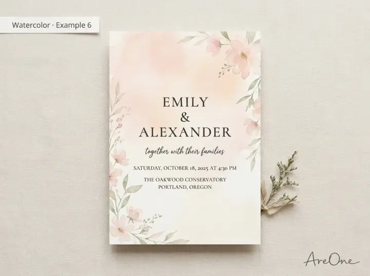
6. Soft wash gradient. Set names on the lightest part of the wash.
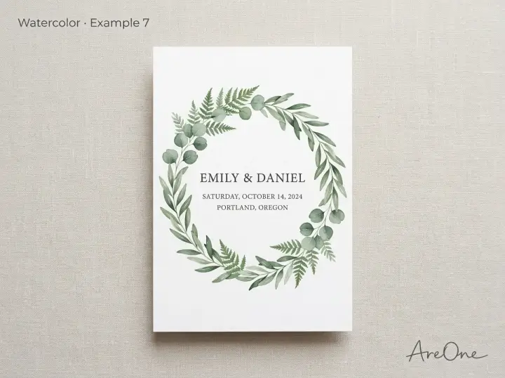
7. Greenery wreath. The wreath frames names; details go below.
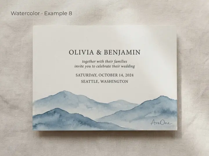
8. Painted landscape. Text lives in the sky.
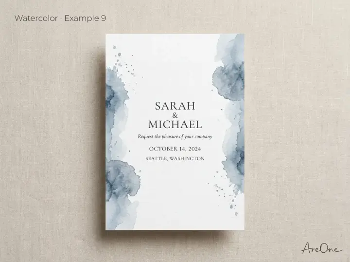
9. Splash edges. Keep the white column wide.
Botanical and greenery backgrounds
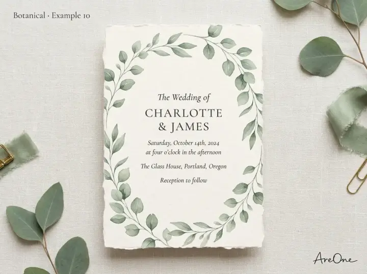
10. Eucalyptus border. Leaves almost the whole card for text.
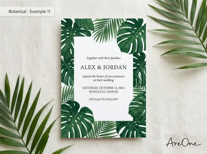
11. Tropical leaves. Use dark green or black text on the white middle.
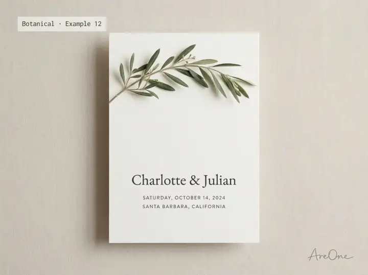
12. Olive branch. Mediterranean and calm, with space below.
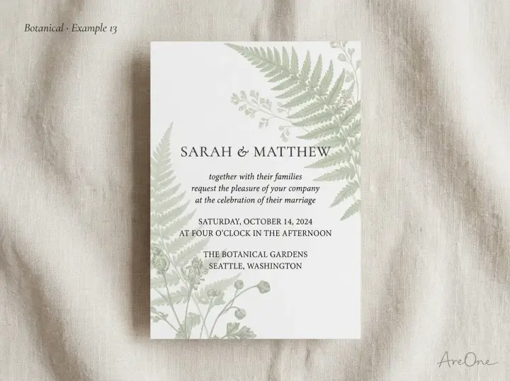
13. Vintage fern print. Low opacity keeps dark text readable.
Marble backgrounds
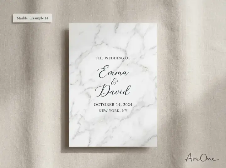
14. White Carrara marble. Black text reads well; avoid thin grey type.
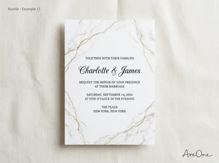
15. Gold-veined marble. Keep veins away from times and addresses.
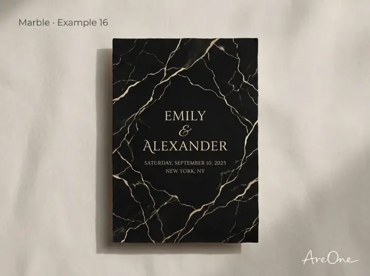
16. Black marble and gold. Use larger, heavier light type.
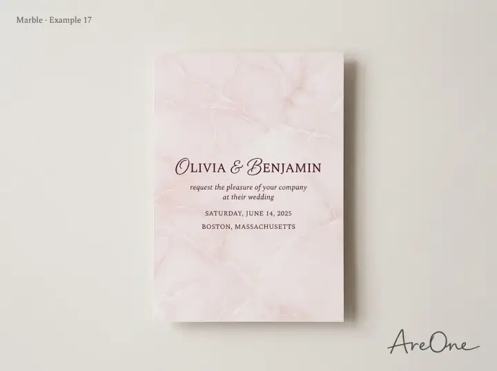
17. Blush marble. Burgundy or charcoal works; white text does not.
Recommended ReadingMinimalist Wedding Invitation Ideas (Templates + Copy) →Textured paper backgrounds
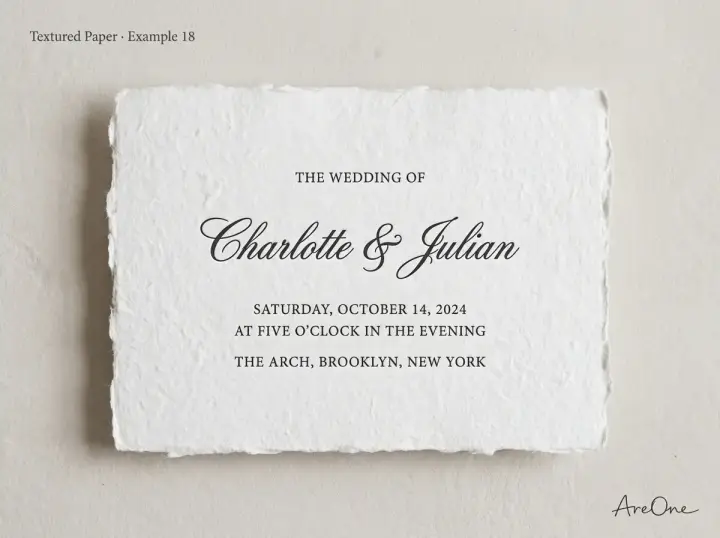
18. Handmade cotton paper. Depth without fighting the words.
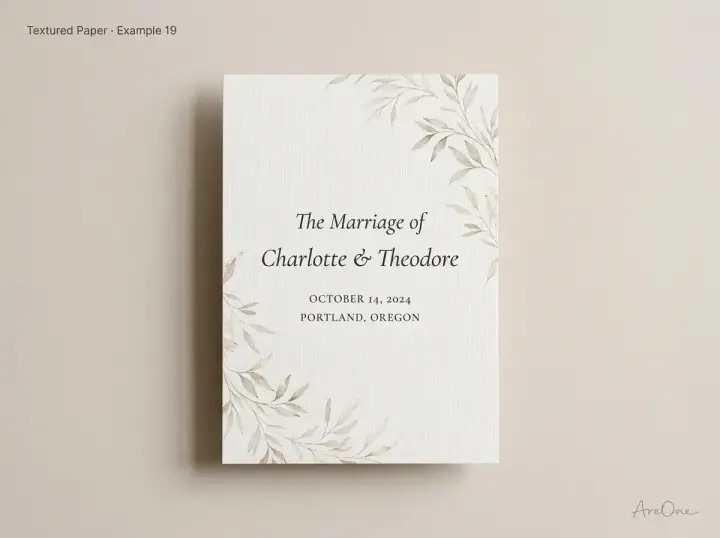
19. Linen texture. Subtle enough for full-card text.
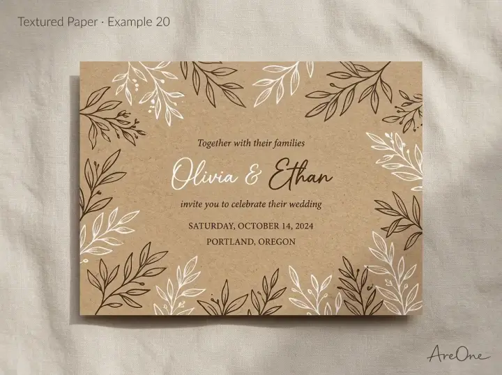
20. Kraft paper. Kraft is mid-tone, so test light and dark ink.
Browse invitation layouts that fit your plan.
Compare layouts for schedules, travel details, guest guidance, and RSVP information before choosing one for your invitation.



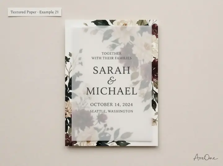
21. Vellum overlay. The frosted layer calms the print underneath.
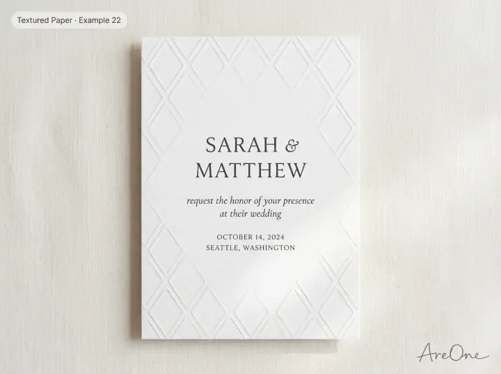
22. Blind deboss pattern. Pattern without colour, so contrast stays high.
Minimal backgrounds
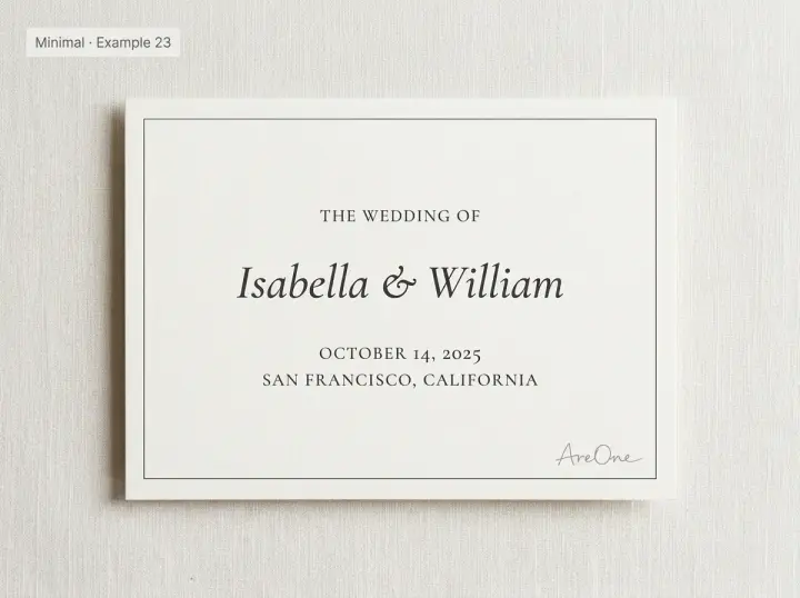
23. Ivory with hairline border. The safest choice for readability.
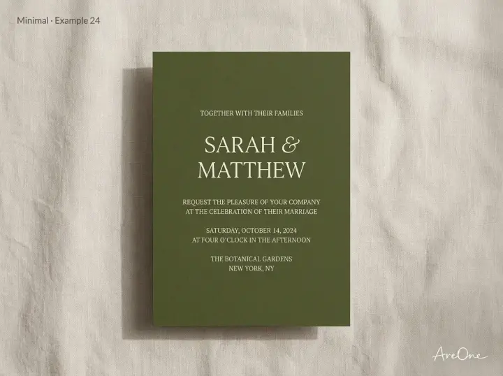
24. Solid colour block. Choose a shade dark enough for white text.
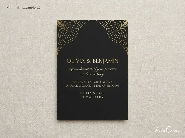
25. Art deco line art. Lines at the edges, text in the centre.
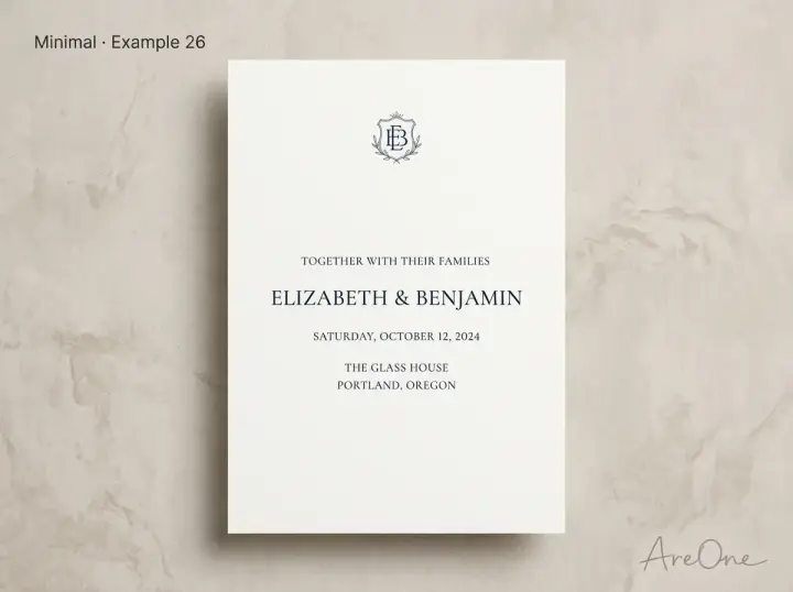
26. Monogram and white space. White space does the work.
Dark and moody backgrounds
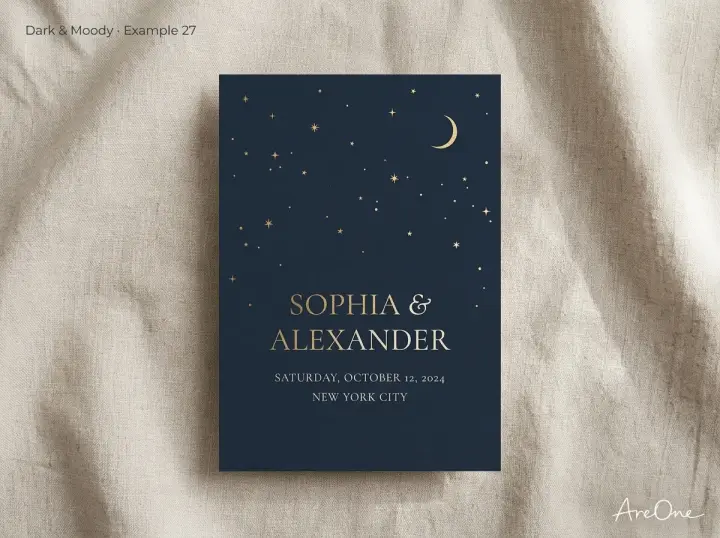
27. Celestial navy. Champagne or gold text; keep stars away from words.
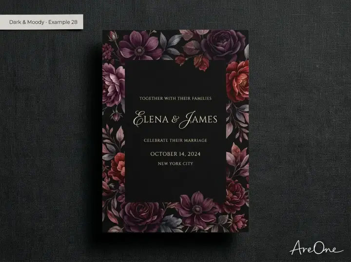
28. Dark florals. Clear a dark panel for text.
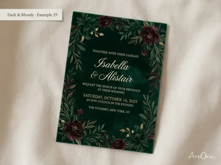
29. Emerald velvet. Even tone, so light text reads well.
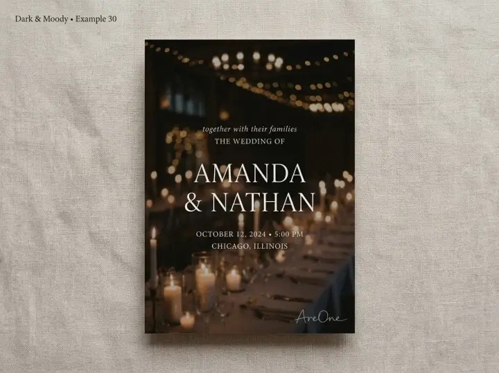
30. Venue photo with overlay. Darken the photo before adding text.
Background ideas by wedding theme
Match your wedding invitation background to your venue and season first, then choose a text colour that stands out against it.
| Theme | Background ideas | Text colour that reads well |
|---|---|---|
| Garden or spring | Peony corners, wisteria, watercolor wash | Charcoal or burgundy |
| Beach or tropical | Monstera leaves, painted coastline | Deep green or navy |
| Rustic or barn | Kraft paper, pressed wildflowers | Dark brown or white on kraft |
| Black tie or ballroom | Black marble, art deco lines | Champagne or gold |
| Modern city | Solid ivory, monogram, white Carrara | Black or charcoal |
| Winter or evening | Celestial navy, emerald velvet | Cream or champagne |
Choosing colors that keep text readable (contrast rules)
Contrast is the difference in lightness between your text and what sits behind it. The Web Content Accessibility Guidelines set clear numbers: the W3C contrast minimum guidance asks for at least 4.5:1 for normal text and 3:1 for large text (about 18 point, or 14 point bold). The stricter enhanced level asks for 7:1.
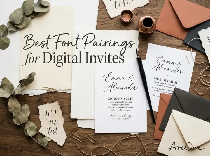
Aim for 4.5:1 on every line. Guests often read on a phone in sunlight, and older relatives need extra contrast. Font choice matters too; our guide to font pairings for digital wedding invites covers that side. For a wider checklist, see accessibility tips for fonts, contrast and layout.
Need a faster RSVP flow?
Use AreOne to collect guest replies, meal choices, and reminders in one clean workflow.
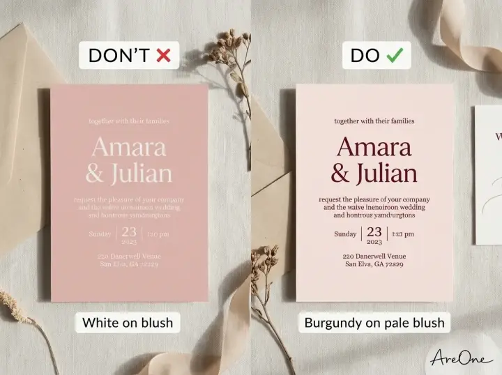
Contrast do and don't pairs
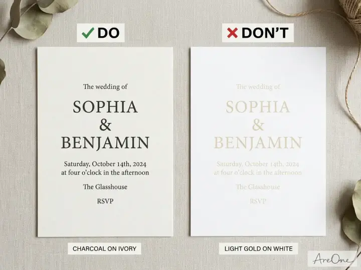
These pairs show measured contrast ratios. Test your own hex codes in a contrast checker before you finalise.
| Text colour | Background | Ratio | Verdict |
|---|---|---|---|
| Charcoal #2F2F2F | Ivory #FAF7F2 | 12.5:1 | Do |
| Light gold #C9A227 | White #FFFFFF | 2.4:1 | Don't |
| Deep green #1F3B2D | Cream #F4EFE6 | 10.7:1 | Do |
| Sage #A8B5A2 | White #FFFFFF | 2.1:1 | Don't |
| Burgundy #5A2A3A | Pale blush #F8EDEB | 10.0:1 | Do |
| White #FFFFFF | Blush pink #E8C4C4 | 1.6:1 | Don't |
| White #FFFFFF | Deep olive #3E4A3D | 9.3:1 | Do |
| White #FFFFFF | Sage #9CAF88 | 2.4:1 | Don't |
| Gold #D4AF37 | Near-black #1C1C1C | 8.1:1 | Do |
| Champagne #E6D3B3 | Navy #0B1F3A | 11.3:1 | Do |
| Antique gold #8C6A2B | White #FFFFFF | 5.0:1 | Do |
| Grey #999999 | White #FFFFFF | 2.8:1 | Don't |
Gold works on dark backgrounds but struggles on white, and pastels rarely carry white text. Metallic foil shifts with the light, so set foil text larger.
Common background mistakes
- Testing one spot only. Photos and watercolors change tone across the card. Check the lightest and darkest areas behind your text.
- White text on pastels. Blush and sage measure far below 4.5:1.
- Thin script on texture. Hairline strokes vanish into marble veins. Use script for large names only.
- Low-resolution images. Stretched web images print blurry.
Busy vs quiet backgrounds: where text goes
Every wedding invitation background has a quiet zone: its calmest, most even area. Your text belongs there. Busy prints and photos need help; linen or solid colour can carry text anywhere.
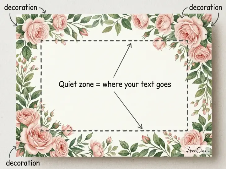
When the quiet zone is too small, use one of these fixes:
- Add a solid or semi-transparent panel behind the text block.
- Lay a dark overlay of 40 to 60 percent over photos before adding white text.
- Lower the pattern's opacity to 15 to 25 percent behind dark text.
- Move decoration to the corners or the bottom third.
Background sizes and file types for print vs digital
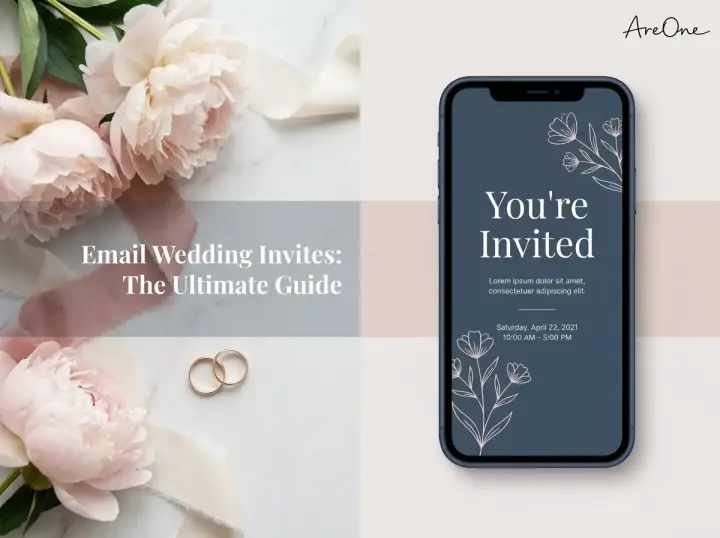
For paper, work at 300 pixels per inch and add bleed so the background runs past the trim. For digital invites, size for a phone held upright. If you are weighing paper against screens, our guide to eco-friendly invitations, digital vs paper compares both.
| Use | Size | File type |
|---|---|---|
| 5 × 7 in printed card | 1575 × 2175 px at 300 ppi, including 0.125 in bleed per side | Print-ready PDF or TIFF |
| Phone invitation (portrait) | 1080 × 1920 px (9:16) | JPG for photos, PNG for flat colour |
| HD or high-density screens | About 2160 px on the long side | JPG or WebP, compressed |
| Repeating pattern or line art | Any size | SVG (vector) where supported |
A wedding invitation background hd file should still be compressed for screens, so it loads quickly on mobile data. If you print and post, remember that square envelopes count as nonmachinable under USPS letter standards and cost more to mail.
Can you use stock wedding invitation background images?
Yes, if the license allows it. Check terms for print runs and editorial-only restrictions, keep the license record, and avoid recognisable people or logos.
Using a template instead of building from scratch
A designed template has already solved resolution, contrast and placement. Here is how to choose an invitation background, or a template built around one:
- Does the wedding invitation background suit your venue and season?
- Is there a clear quiet zone for names, date and venue?
- Does every line of text reach 4.5:1 contrast?
- Does it look sharp on a phone screen and, if needed, in print?
You can browse AreOne's digital invitation templates to find a style that matches your theme, then add your details, online RSVP and a shareable link.
Let your background stay in the background
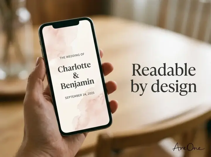
The best wedding invitation background is the one guests notice second: it sets the mood, then lets your names and date take centre stage.
Frequently Asked Questions
Find quick answers to common questions about this article.
No approved comments yet.