
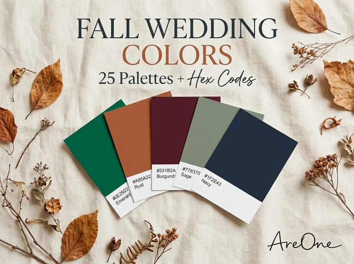
TL;DR: Pick fall wedding colors that suit your venue and light, then use our 25 palettes with exact hex codes to place each shade on attire, flowers, tables and your invitation.
Most fall wedding colors lists stop at a pretty photo, which leaves you guessing when your florist asks for “that rust”. So every palette below has three or four hex codes you can copy, plus a short note on where each shade works best.
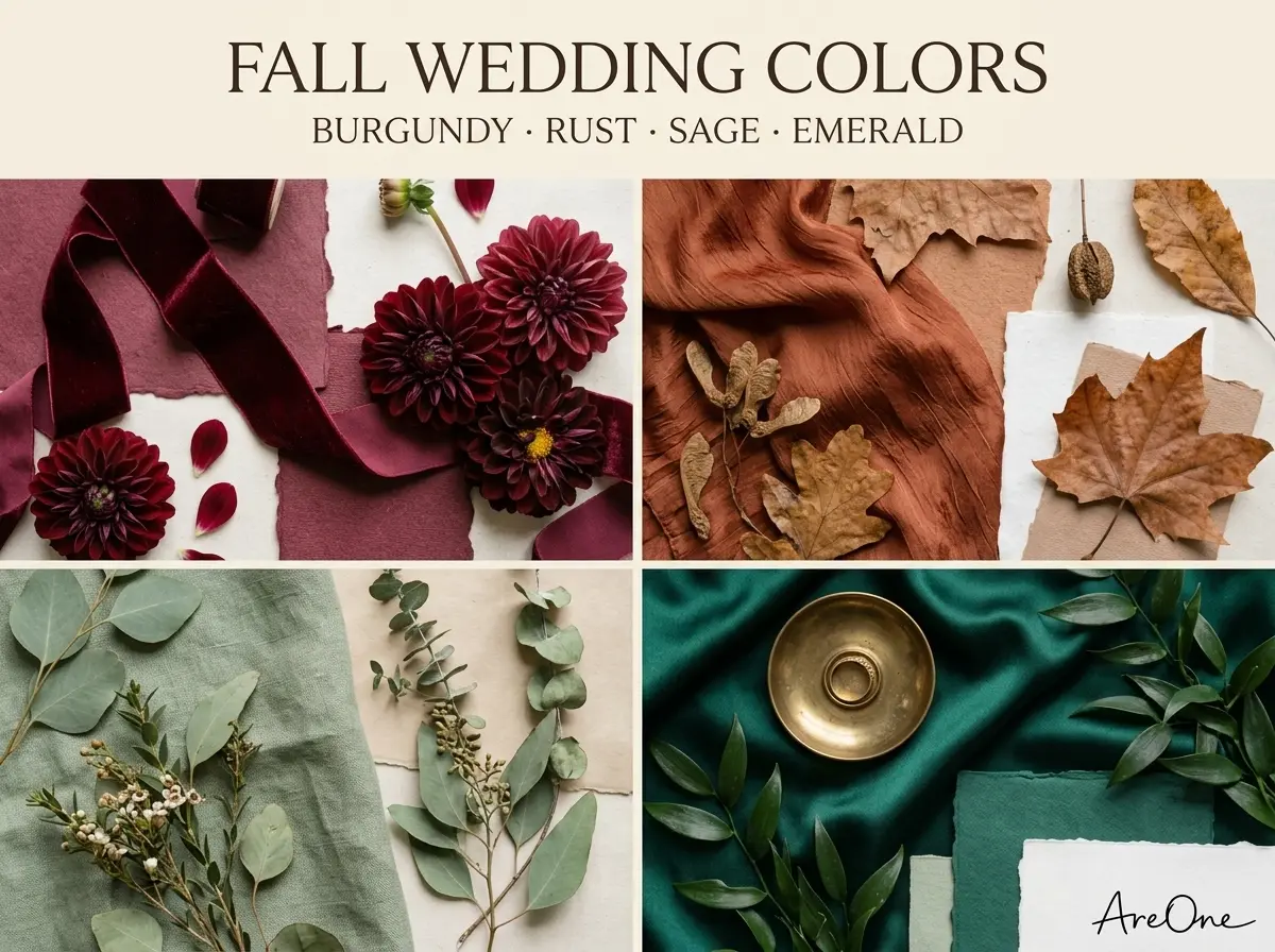
How to choose a fall palette (venue, light, time of day)
Before you fall for a swatch, look at the place and the hour. Autumn light is low, warm and fades early, so a colour that glows at 3 p.m. can turn muddy by 6 p.m. under warm bulbs.
- Venue: Let the room lead. Brick, dark wood and stone already add warm tones, so pick shades that sit beside them. A white gallery or tent suits bolder jewel tones.
- Light: Daylight makes muted, earthy shades look rich. Candlelight deepens reds and shifts blues, so test navy under the venue's real lighting.
- Time of day: Afternoons suit lighter, earthy palettes; evenings can carry burgundy and black.
- Month: Early fall still feels like summer, so peach, sage and marigold work. October wedding colors can lean into foliage shades, and November goes deeper and darker.
- Hemisphere: South of the equator, fall runs roughly March to May, so adjust our month notes.
Many designers use the 60-30-10 rule: a main colour for about 60% of what guests see, a support colour for 30% and an accent for 10%. Neutrals like ivory don't count. For colour trend context, see Pantone's Color of the Year (Cloud Dancer, Pantone 11-4201, for 2026).
25 fall palettes, each with 3–4 hex codes and where to use it
We grouped these fall wedding color palettes into three families: jewel, earthy and moody. Pick a family, then a palette; the first colour is the main shade. Hex codes guide screens and print, but fabric and flowers never match perfectly, so ask vendors for physical samples.
Jewel-tone palettes (emerald, plum, sapphire)
A jewel tone fall wedding feels rich and a little dramatic. These fall wedding colors shine on velvet and silk and glow by candlelight, so they suit evening ballrooms.
1. Emerald, Antique Gold and Ivory — emerald #0B6E4F, antique gold #B8913A, ivory #F4EEDF, pine #1E3B2F. Use: Emerald on dresses and velvet runners, gold on candle holders, ivory on linens.
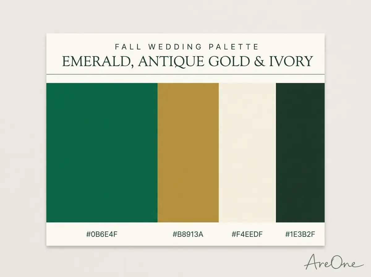
2. Plum, Dusty Blush and Champagne — plum #5E2750, dusty blush #D8A7A0, champagne #E9D8B4, smoke grey #6B6570. Use: Plum on dahlias and suits, blush on napkins, champagne on the cake.
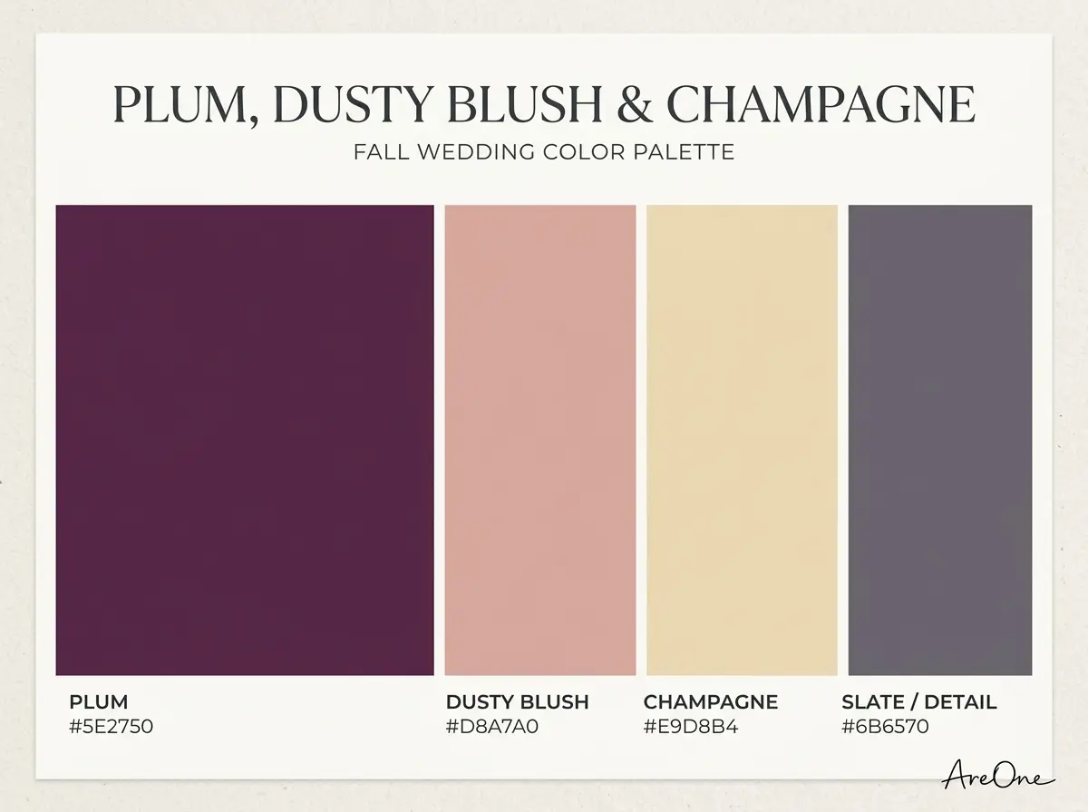
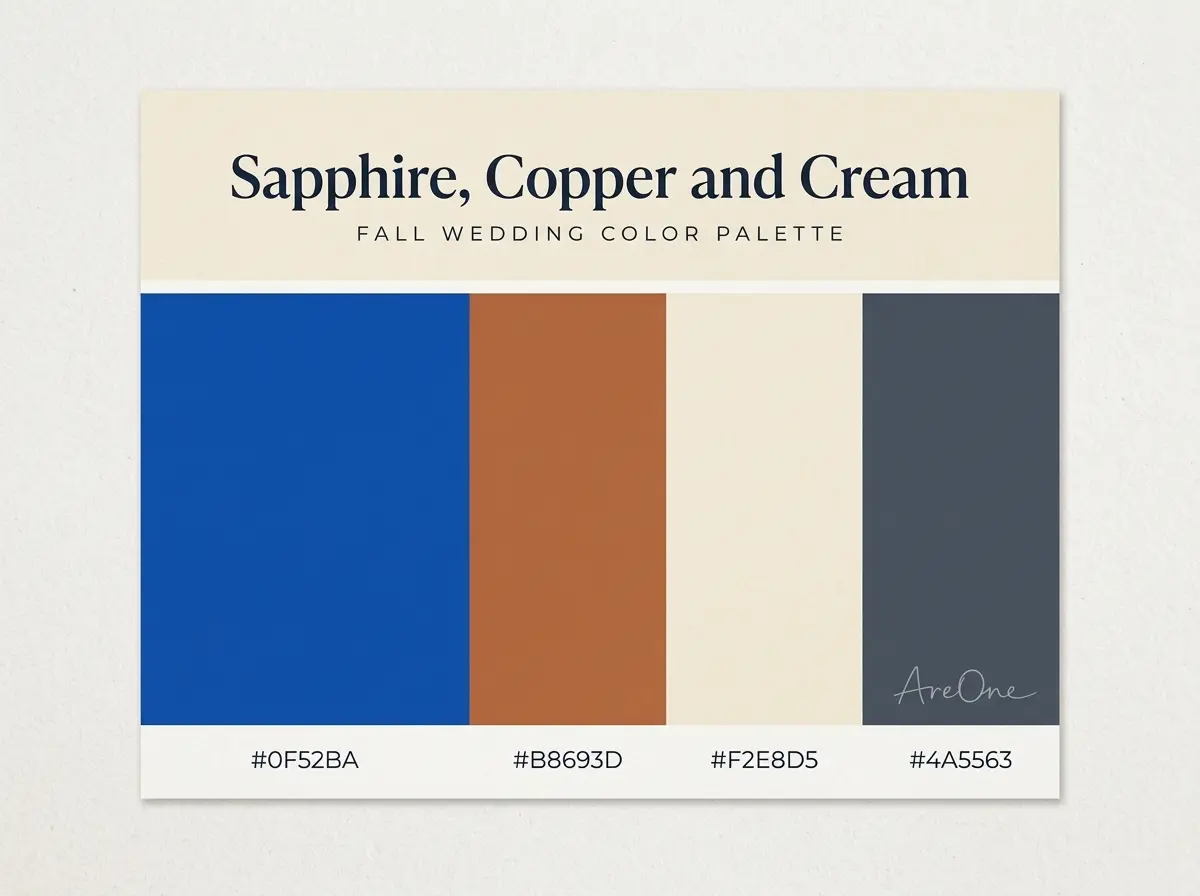
3. Sapphire, Copper and Cream — sapphire #0F52BA, copper #B8693D, cream #F2E8D5, slate #4A5563. Use: Sapphire on suits and glassware, copper on lanterns, cream on flowers.
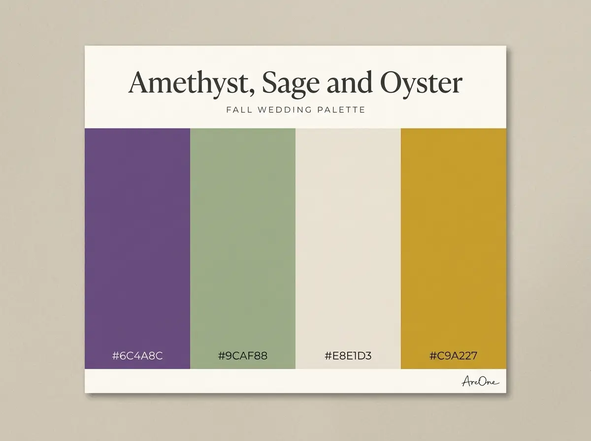
4. Amethyst, Sage and Oyster — amethyst #6C4A8C, sage #9CAF88, oyster #E8E1D3, soft gold #C9A227. Use: Amethyst on dresses, sage on foliage, oyster on linens, gold as the only metal.
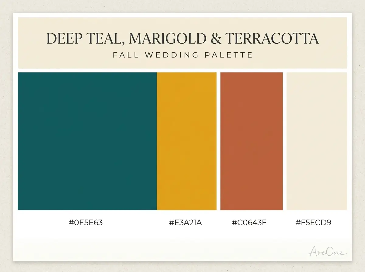
5. Deep Teal, Marigold and Terracotta — deep teal #0E5E63, marigold #E3A21A, terracotta #C0643F, cream #F5ECD9. Use: Teal on tablecloths, marigold on flowers, terracotta on bud vases.
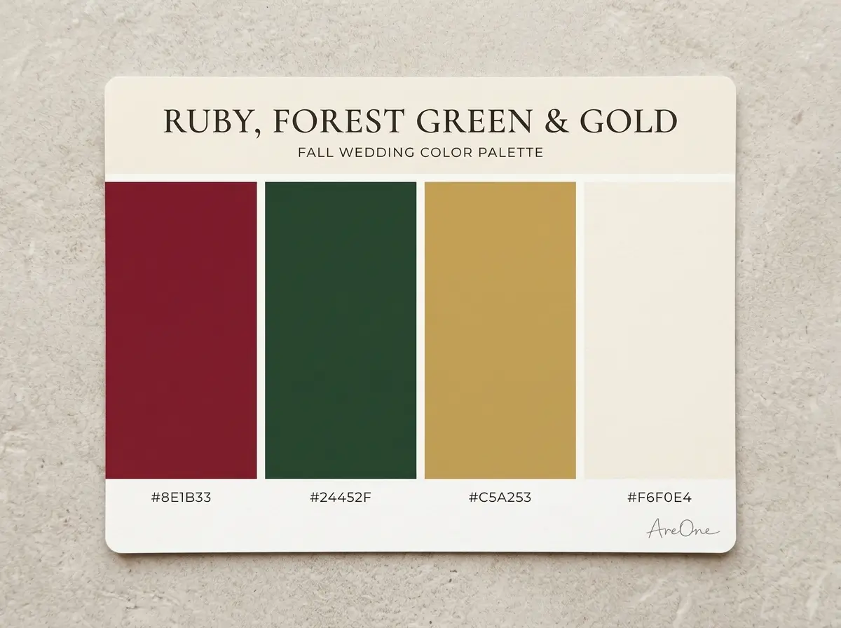
6. Ruby, Forest Green and Gold — ruby #8E1B33, forest green #24452F, gold #C5A253, ivory #F6F0E4. Use: Ruby on roses, forest green on garlands, gold on frames.
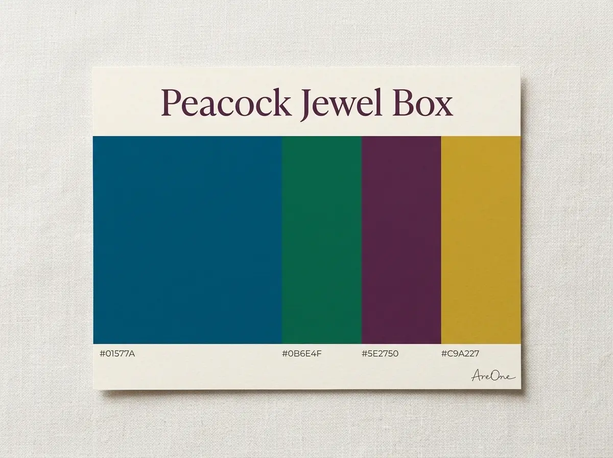
7. Peacock Jewel Box — peacock blue #01577A, emerald #0B6E4F, plum #5E2750, gold #C9A227. Use: The full jewel tone fall wedding look; mix the gems across bridesmaids and keep every metal gold.
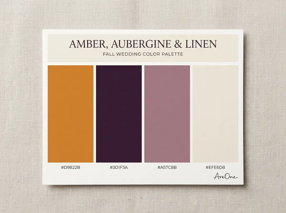
8. Amber, Aubergine and Linen — amber #D9822B, aubergine #3D1F3A, mauve #A57C8B, linen #EFE6D8. Use: Aubergine on suits and candles, amber on flowers, mauve on ribbons.
Earthy palettes (rust, terracotta, camel, sage)
Earthy fall wedding colors borrow from the landscape: turning leaves, dried grasses, clay and bark. They love daylight, barns and gardens. Rust and sage wedding colors are the easiest place to start.
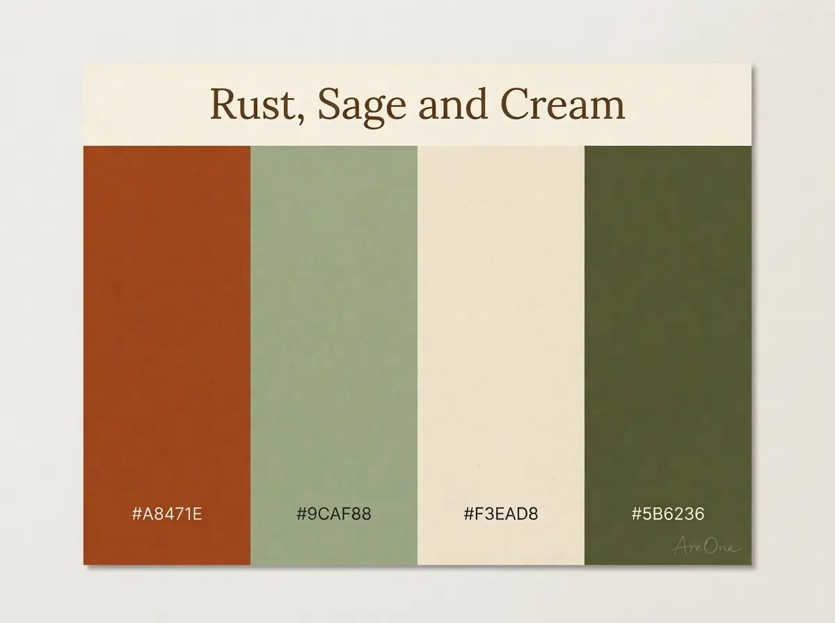
9. Rust, Sage and Cream — rust #A8471E, sage #9CAF88, cream #F3EAD8, olive #5B6236. Use: Rust on dresses and ribbon, sage on foliage and napkins, cream on linens.
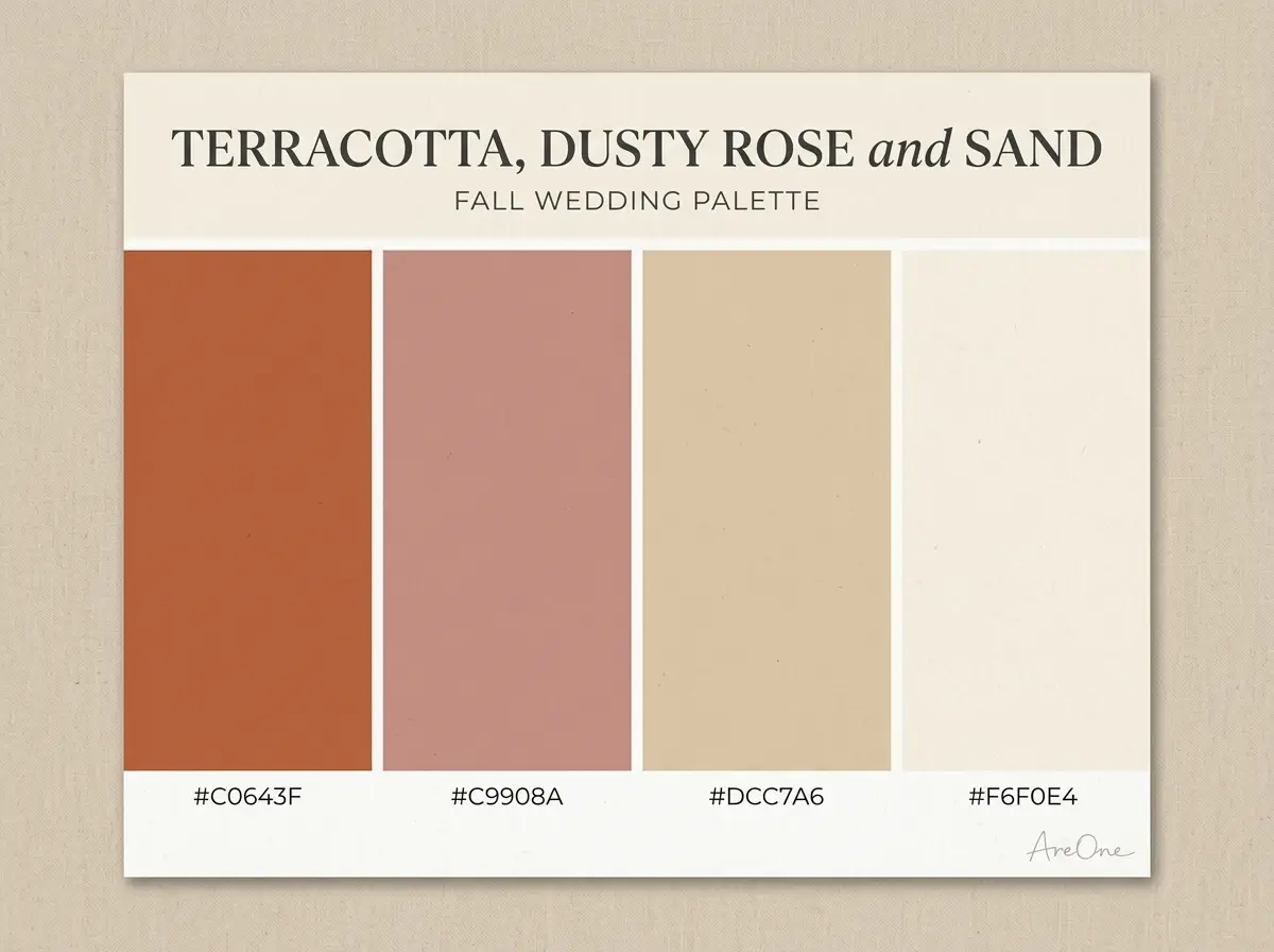
10. Terracotta, Dusty Rose and Sand — terracotta #C0643F, dusty rose #C9908A, sand #DCC7A6, ivory #F6F0E4. Use: Terracotta on pottery and bridesmaids, dusty rose on flowers, sand on runners.
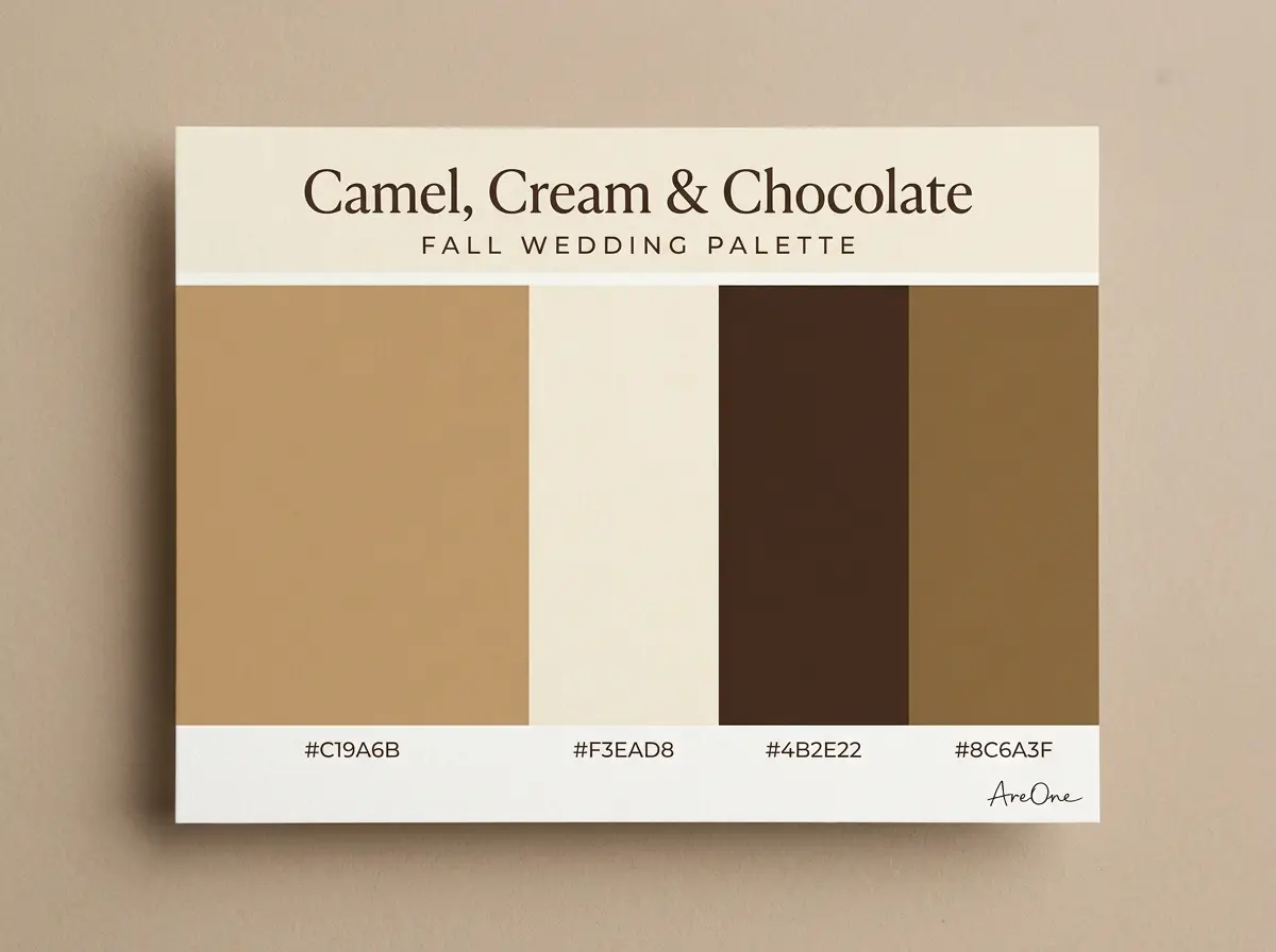
11. Camel, Cream and Chocolate — camel #C19A6B, cream #F3EAD8, chocolate #4B2E22, bronze #8C6A3F. Use: Camel on suits, cream on flowers, chocolate on text and wood, bronze for metal.
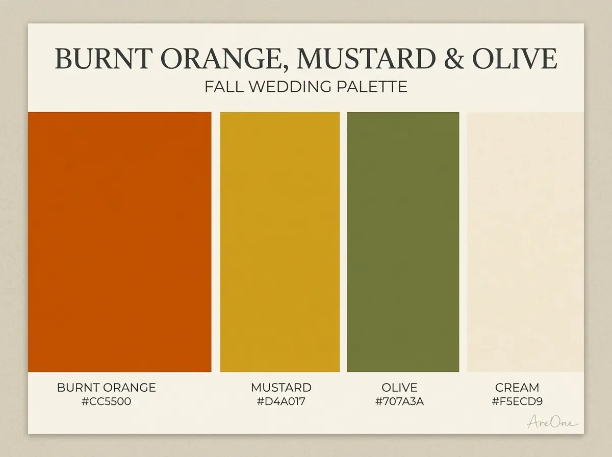
12. Burnt Orange, Mustard and Olive — burnt orange #CC5500, mustard #D4A017, olive #707A3A, cream #F5ECD9. Use: Burnt orange on flowers and ties, mustard on napkins, olive on foliage.
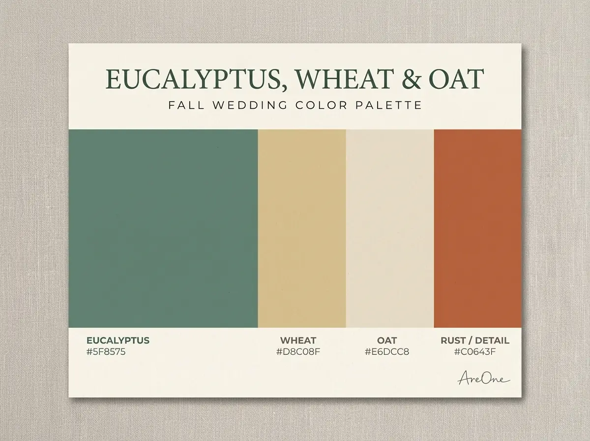
13. Eucalyptus, Wheat and Oat — eucalyptus #5F8575, wheat #D8C08F, oat #E6DCC8, terracotta #C0643F. Use: Eucalyptus on greenery, wheat on dried grasses, terracotta as one small pop.
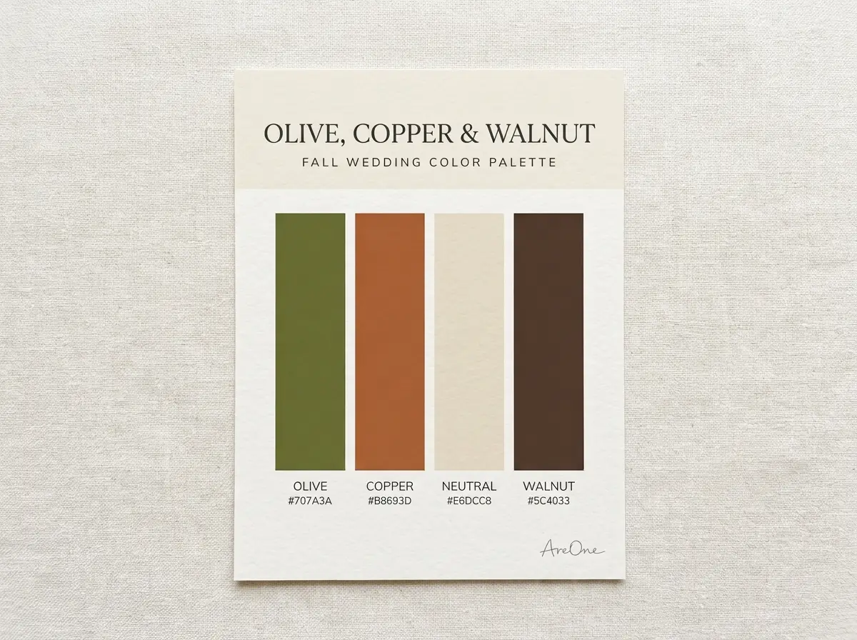
14. Olive, Copper and Walnut — olive #707A3A, copper #B8693D, oat #E6DCC8, walnut #5C4033. Use: Olive on suits, copper on flatware, walnut tables left bare.
Browse invitation layouts that fit your plan.
Compare layouts for schedules, travel details, guest guidance, and RSVP information before choosing one for your invitation.



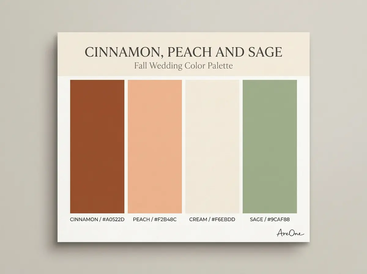
15. Cinnamon, Peach and Sage — cinnamon #A0522D, peach #F2B48C, cream #F6EBDD, sage #9CAF88. Use: Cinnamon on bridesmaids, peach on roses, sage on leaves.
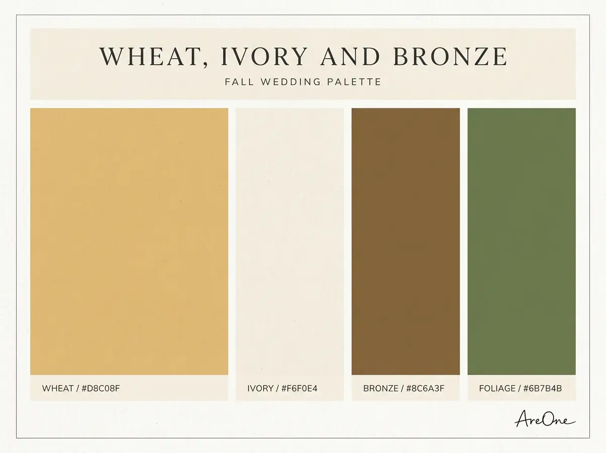
16. Wheat, Ivory and Bronze — wheat #D8C08F, ivory #F6F0E4, bronze #8C6A3F, moss #6B7B4B. Use: Wheat on florals, ivory on attire, bronze for metal, moss on greenery.
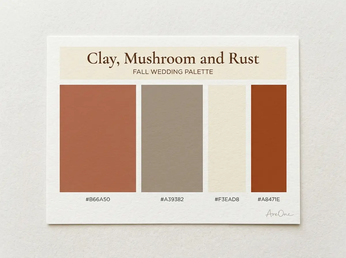
17. Clay, Mushroom and Rust — clay #B66A50, mushroom #A39382, cream #F3EAD8, rust #A8471E. Use: Clay on dresses, mushroom on linens and suits, rust on candles.
Moody palettes (burgundy, navy, black)
Moody fall wedding colors suit short days and candlelit dinners. Pair a dark main colour with one warm metal and one soft neutral so the room still feels warm. A burgundy and gold fall wedding is the classic example.
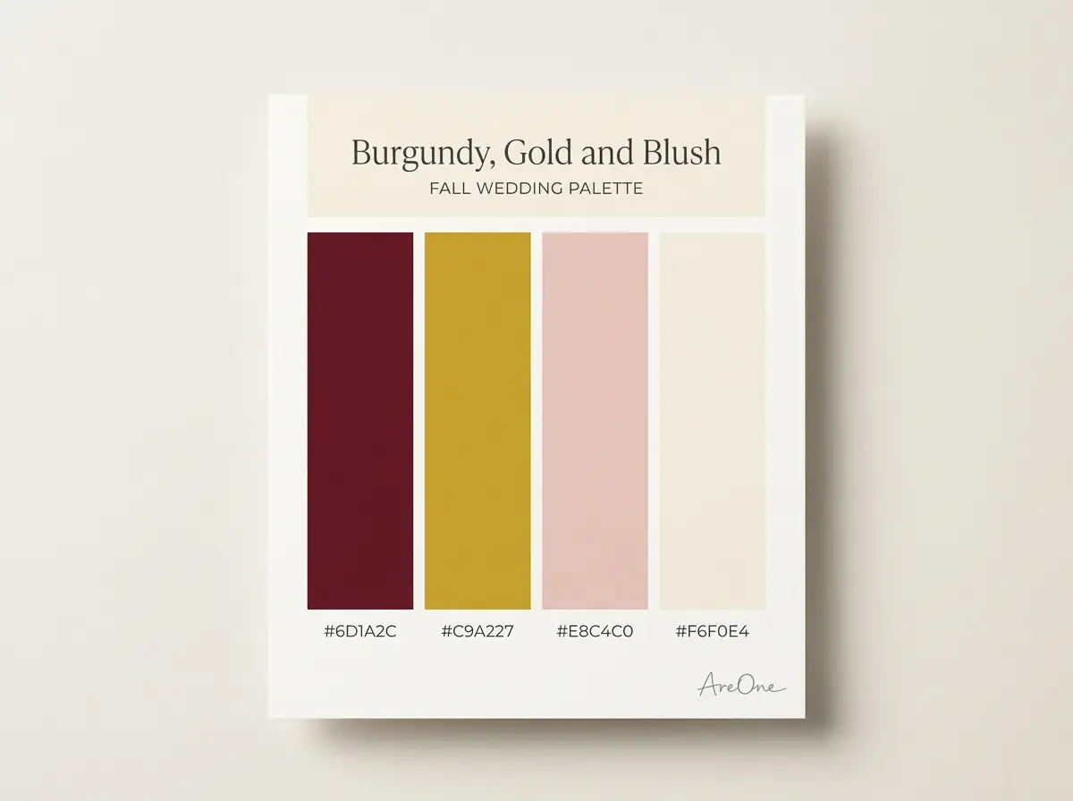
18. Burgundy, Gold and Blush — burgundy #6D1A2C, gold #C9A227, blush #E8C4C0, ivory #F6F0E4. Use: Burgundy on dresses and roses, gold for metal, blush to soften.
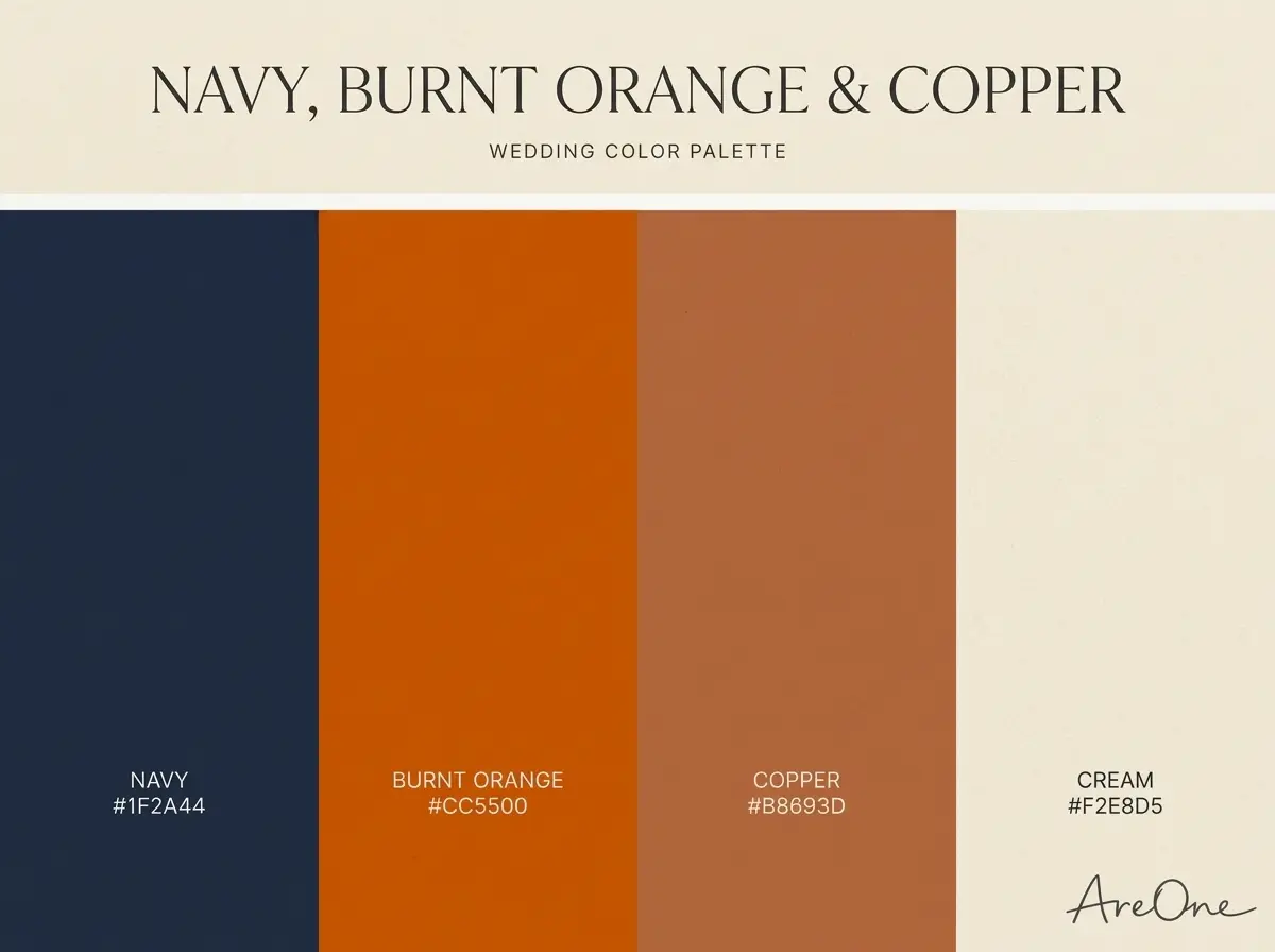
19. Navy, Burnt Orange and Copper — navy #1F2A44, burnt orange #CC5500, copper #B8693D, cream #F2E8D5. Use: Navy on suits, burnt orange on flowers, copper on lanterns.
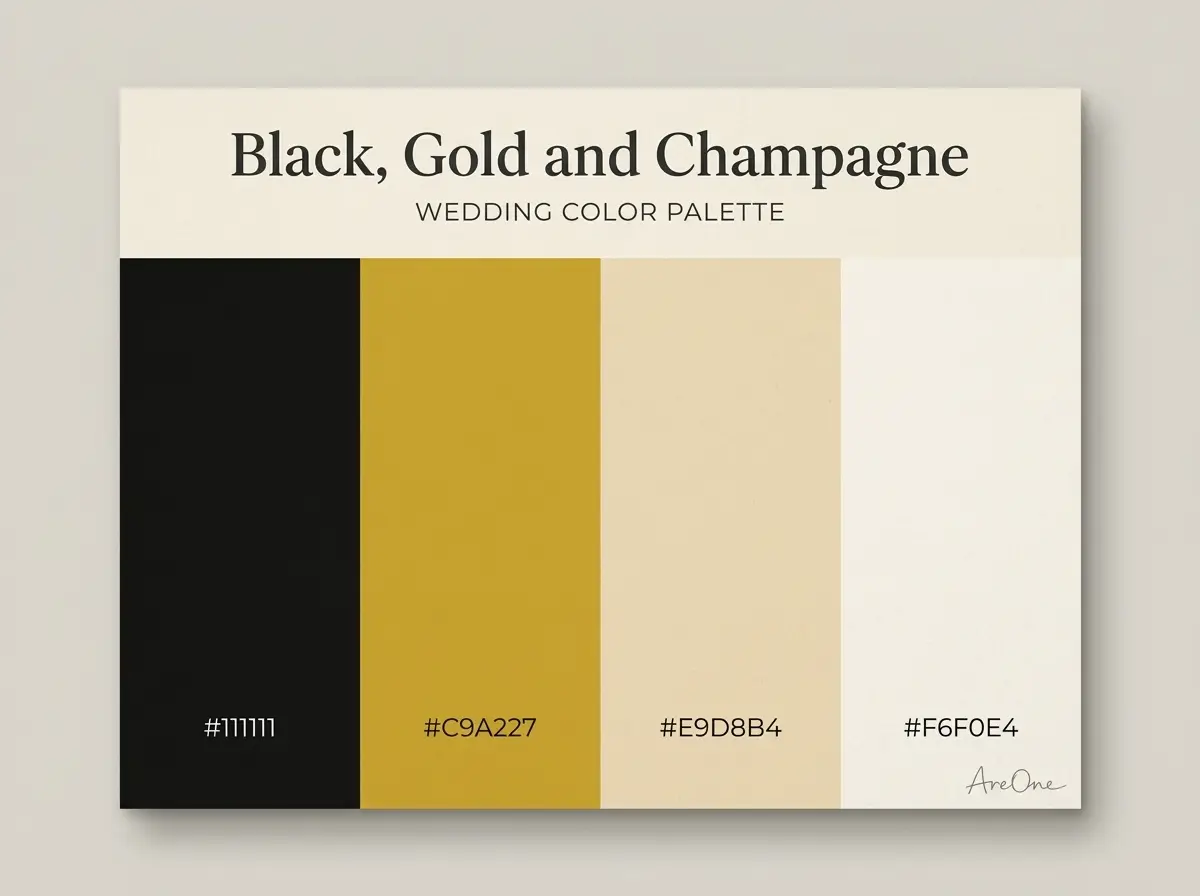
20. Black, Gold and Champagne — black #111111, gold #C9A227, champagne #E9D8B4, ivory #F6F0E4. Use: Black on tuxedos and candles, gold on flatware, champagne on linens.
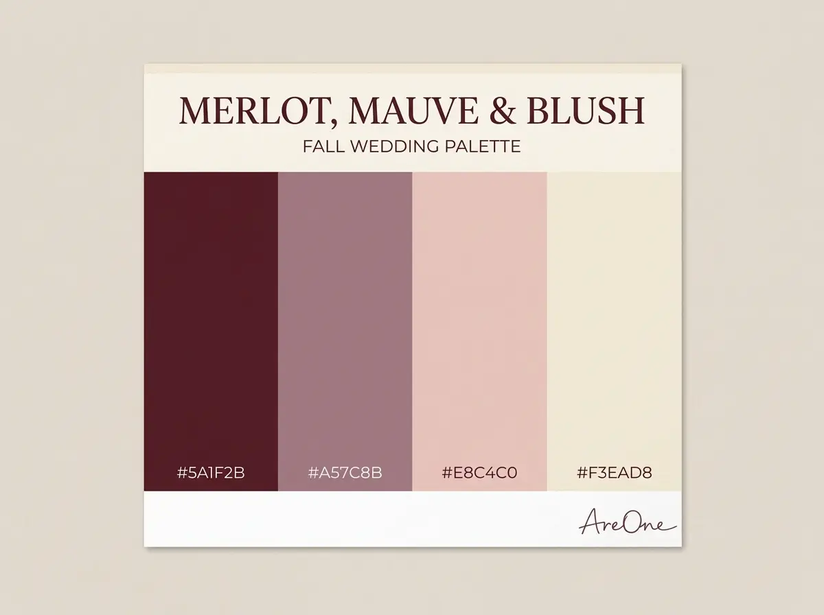
21. Merlot, Mauve and Blush — merlot #5A1F2B, mauve #A57C8B, blush #E8C4C0, cream #F3EAD8. Use: Merlot on velvet and roses, mauve on dresses, blush on napkins.
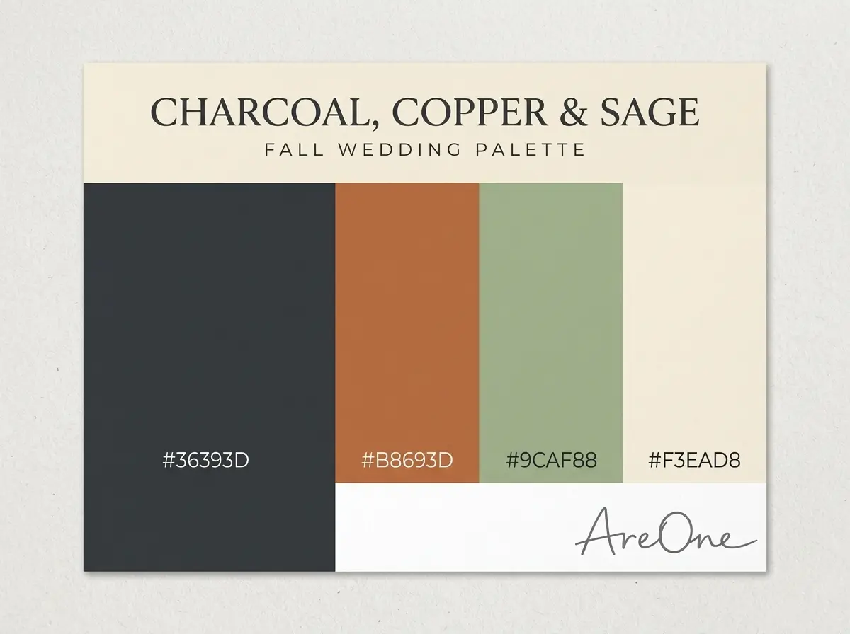
22. Charcoal, Copper and Sage — charcoal #36393D, copper #B8693D, sage #9CAF88, cream #F3EAD8. Use: Charcoal on suits and signs, copper for metal, sage on greenery.
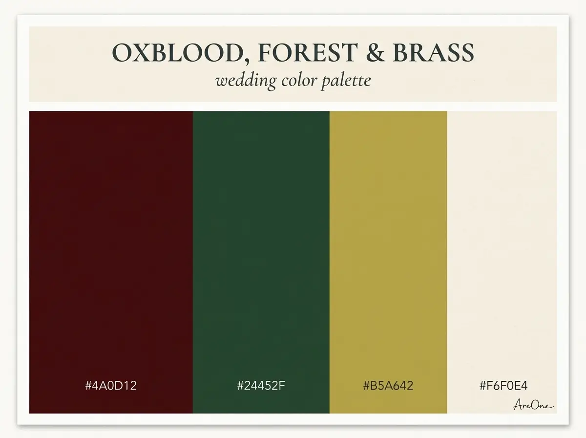
23. Oxblood, Forest and Brass — oxblood #4A0D12, forest green #24452F, brass #B5A642, ivory #F6F0E4. Use: Oxblood on flowers, forest green on garlands, brass on candlesticks.
Need a faster RSVP flow?
Use AreOne to collect guest replies, meal choices, and reminders in one clean workflow.
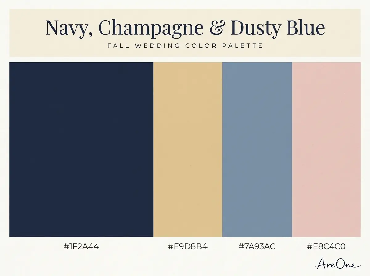
24. Navy, Champagne and Dusty Blue — navy #1F2A44, champagne #E9D8B4, dusty blue #7A93AC, blush #E8C4C0. Use: Navy on suits, dusty blue on dresses, champagne on linens, blush on flowers.
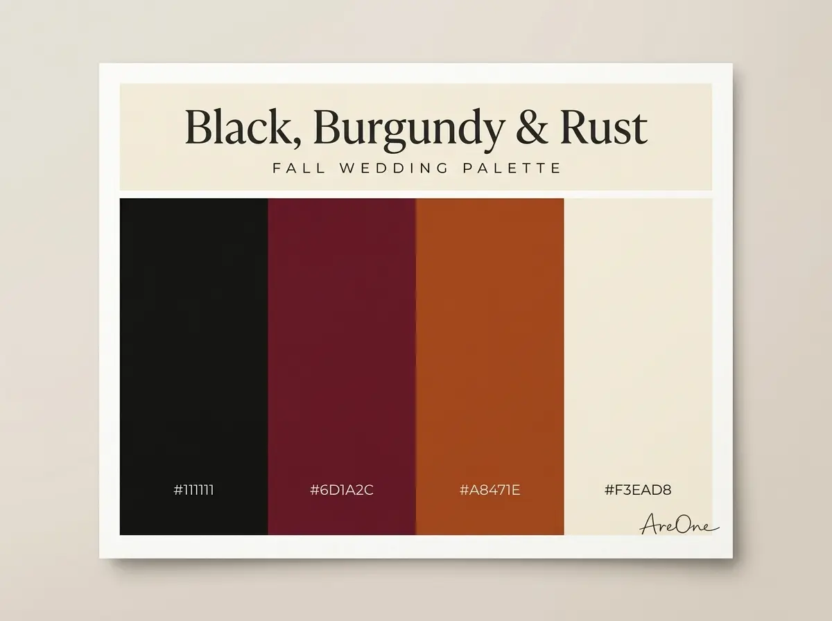
25. Black, Burgundy and Rust — black #111111, burgundy #6D1A2C, rust #A8471E, cream #F3EAD8. Use: Black on attire, burgundy on flowers, rust on napkins.
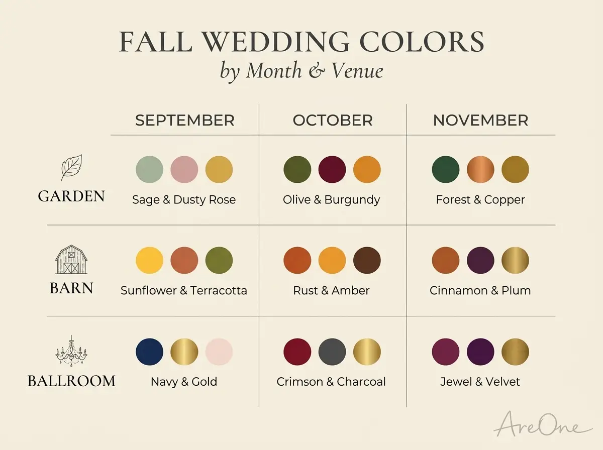
Fall wedding colors by month and venue: quick-reference table
Use this table to shortlist palettes for your date and setting. Looking for October wedding colors? Scan the middle column; earthy and wine shades echo peak foliage.
| Palette | Best month | Venue type |
|---|---|---|
| Emerald, Antique Gold and Ivory | November | Hotel ballroom, historic mansion |
| Plum, Dusty Blush and Champagne | October | Winery, garden estate |
| Sapphire, Copper and Cream | November | City loft, lakeside lodge |
| Amethyst, Sage and Oyster | September | Garden, conservatory |
| Deep Teal, Marigold and Terracotta | September | Courtyard, restaurant |
| Ruby, Forest Green and Gold | November | Mountain lodge, manor house |
| Peacock Jewel Box | November | Ballroom, art gallery |
| Amber, Aubergine and Linen | October | Barn, vineyard |
| Rust, Sage and Cream | October | Barn, farm, rustic lodge |
| Terracotta, Dusty Rose and Sand | September | Desert venue, courtyard |
| Camel, Cream and Chocolate | November | Library, cabin, city hall |
| Burnt Orange, Mustard and Olive | October | Orchard, farm |
| Eucalyptus, Wheat and Oat | September | Meadow, outdoor tent |
| Olive, Copper and Walnut | October | Brewery, industrial loft |
| Cinnamon, Peach and Sage | September | Garden, beach in early fall |
| Wheat, Ivory and Bronze | October | Chapel, small farm |
| Clay, Mushroom and Rust | October | Desert, boho backyard |
| Burgundy, Gold and Blush | November | Ballroom, historic hotel |
| Navy, Burnt Orange and Copper | October | Lakeside lodge, barn |
| Black, Gold and Champagne | November | City rooftop, ballroom |
| Merlot, Mauve and Blush | October | Vineyard, winery |
| Charcoal, Copper and Sage | November | Industrial loft, brewery |
| Oxblood, Forest and Brass | November | Manor house, lodge |
| Navy, Champagne and Dusty Blue | September | Coastal venue, garden |
| Black, Burgundy and Rust | November | Restaurant, city venue |
Using the palette: attire, florals, tables, invitation
Once you have a palette, share it with every vendor in one message. Copy and adapt this one.
Copy-paste example: “Hi [Vendor Name], our palette is [Main Colour] [#hex code], [Support Colour] [#hex code] and [Accent] [#hex code], with [Metal] as our only metal. Could you send a photo of your closest options in daylight? Thanks, [Your Names].”
It works because it names every shade, sets the metal rule and asks for real-world proof before anything is ordered.
Attire and florals, from rust and sage wedding colors to jewel tones
Put your main colour on the wedding party, since they appear in most photos. Mixing two or three shades across bridesmaids looks intentional and flatters more skin tones. Flowers can carry the accent; ask your florist what is in season.
Tables and the invitation
On tables, use neutrals for linens, the support colour for napkins and the accent for candles. Your invitation is the first place guests see your fall wedding colors, so use the main colour for headings and keep body text dark on a light background. For type ideas, see our guide to wedding invitation font pairings, and if you like a pared-back look, our minimalist wedding invitation ideas show how one accent colour can carry a whole design. For the words themselves, use our wedding invitation wording examples.
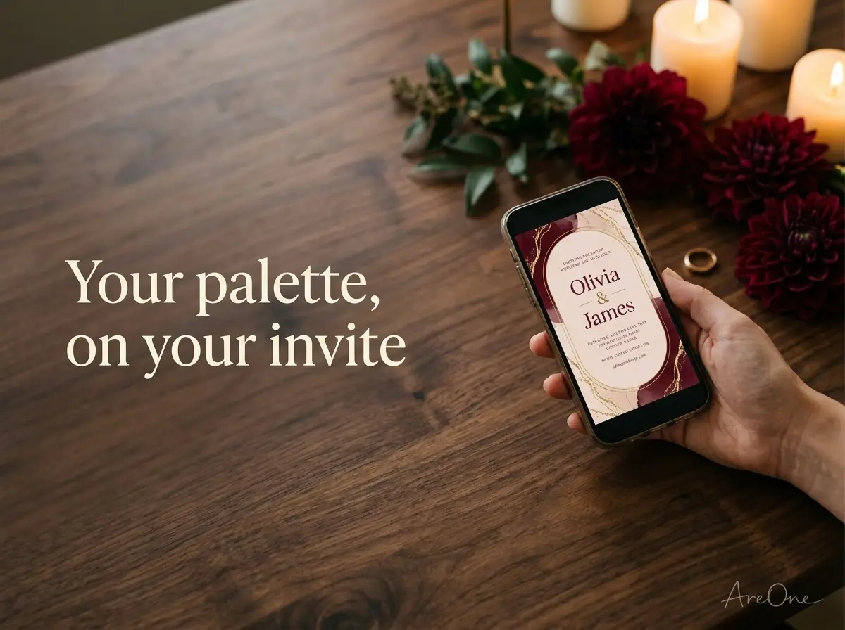
With AreOne, you can choose a template and share your digital invitation with online RSVP through a link or QR code.
Palette mistakes (too many accents, clashing metals)
Even great fall wedding color palettes can go wrong in the details.
- Too many accents: Five bright shades fight for attention. Keep one or two accents and let neutrals do the quiet work.
- Clashing metals: Gold flatware, silver frames and rose-gold candle holders together look accidental. Choose one main metal; if you mix, repeat the second on purpose.
- Trusting your screen: Phones and monitors show colour differently, so check printed proofs and fabric samples.
- Ignoring the lighting: Navy can read as black in dim rooms. Visit the venue at your reception hour.
- Low-contrast text: Gold text on ivory is hard for older guests to read. Keep words dark and save pale shades for borders.
For photo inspiration, The Knot has a gallery of fall wedding colors to pair with the hex codes above.
Fall in love with your colours
The right fall wedding colors set the mood before anyone arrives. Choose one palette, write down the hex codes and let every detail fall into place.
Frequently Asked Questions
Find quick answers to common questions about this article.

No approved comments yet.